
A reporter’s inquiry led me to look into the changing mix of offenses among people in Wisconsin’s prisons 2000-2014. This is a short version of a longer report about what what I found. A report in the Wisconsin Taxpayer Magazine provides a substantial amount of analysis, including summaries of important policies that have affected imprisonment, and is worth reading in its entirety. The WTM report stresses imprisonment due to revocations, felony drunk driving, and violent crime. I knew that Black imprisonment for drugs had declined since the mid-2000s, and White imprisonment for drunk driving had risen, but I was not sure what the trends were for violent crime. This led me to dig into the imprisonment patterns by offense and admission type. Although most of my work focuses on racial difference, here I am just looking all races taken together and looking at the raw numbers, not racial differences.
The total number of people in Wisconsin prisons actually declined 2008-2010 but began rising again in 2012. However, the decline was quite small relative to the total.
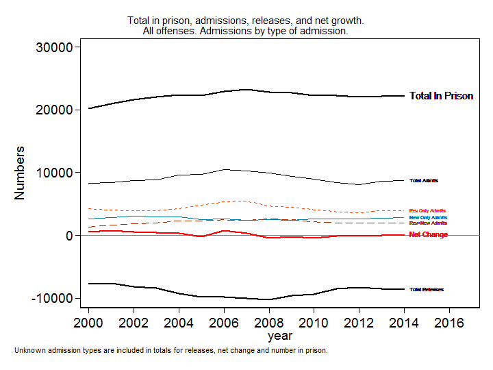
The graph shows the rise in number in prison through 2007, then a small net decline 2008-2010. The change in the number in prison is the net of prison admissions minus prison releases. Breaking out prison admissions by type indicates that the decline in imprisonment mostly tracked the decline in revocations, as new commitments actually rose slightly while total imprisonment was declining. (See my previous post for more information on revocations.)
Most discussions of imprisonment (including my own past work) lump violent crimes together, but any attempt to link crime rates to imprisonment has to examine specific offense. As I explained in a previous blog post, people who commit serious violent crimes spend more time in prison and thus account for a higher percentage of people in the “snapshot” of who is in prison at any one time, while prison admissions numbers track who is flowing into (and then out of) prison and contain a higher proportion of people who get shorter sentences for less serious crimes. Averaging across all years 2000-2014, you can see the difference in the offense mix of those in prison vs. those admitted to prison.
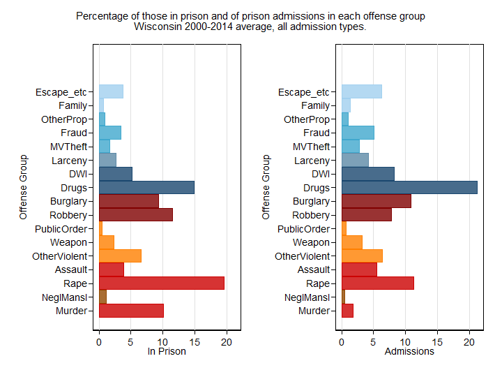
Murder was only 2% of prison admissions but 10% of those in prison. Rape was the most common offense among those in prison, accounting for 20% of inmates in prison, and second most common in prison admissions at 11%. Drug offenses were the most common group at 21% among prison admissions, but the second most common group among those in prison at 15%. Murder, negligent manslaughter, rape, robbery and “other violent” offenses are a higher proportion among those in prison than among those admitted to prison; all other offenses are more common among prison admissions than among those in prison.
Although assault is by far the most common crime in the violent crime index, assault is infrequently punished with imprisonment and it accounts for a relatively small percentage of prison admissions and even less of those in prison. There are fewer people in prison for assault than for the “other violent” category of crimes that are not even in the violent crime index, primarily reckless endangerment and also reckless injury, kidnapping, physical abuse of a child, and strangulation.
All the violent offenses taken together (murder, rape, negligent homicide, assault, and other violent) were only 26% of prison admissions but 42% of those in prison. If we add in robbery, which is officially counted as a violent offense, the sums are 34% violent for admissions and 53% violent for those in prison. Combining drugs and DWI gives us 30% of all admissions but only 20% of those in prison for crimes related to substance abuse. The property crimes (larceny, fraud, motor vehicle theft, other property) account for 13% of admissions and 9% of those in prison; if burglary is added to property crimes (as it usually is in official statistics), we get 24% of admissions and 19% of those in prison. Weapons offenses and other public order offenses account for relatively small percentages. Among the remaining group, we note that for 6% of admissions and 4% of those in prison, the governing offense is not a crime in the usual sense, but an offense derived from violating control, including escape or supervision violations or warrants. “Offenses against the family,” a small category that I separate because it really does not belong with any of the others, accounts for 1% of both admissions and those in prison.
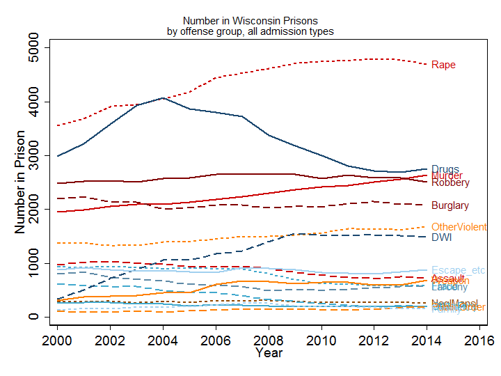
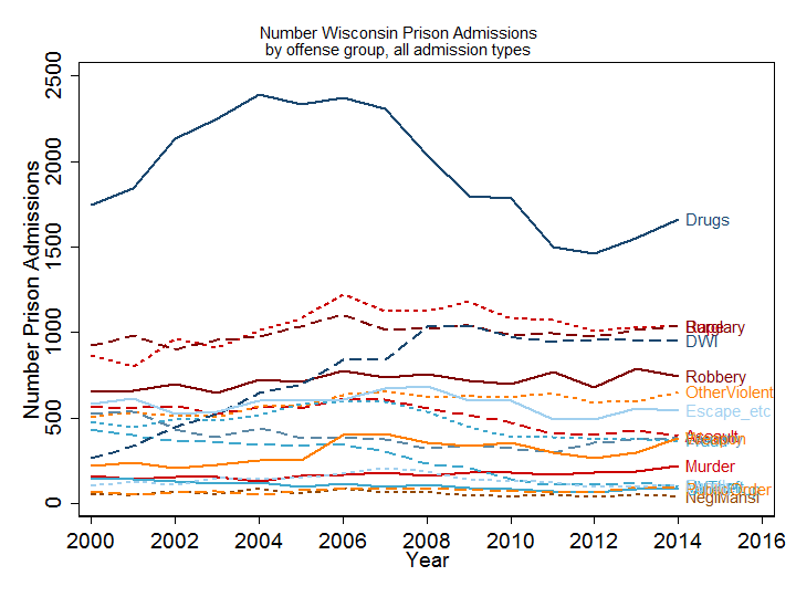
Looking at the offense mix over time tells a pretty clear story. As the drug war declined, rape became the most common offense among those in prison. The number of murderers in prison rose steadily and the number in prison for drunk driving (DWI) rose steeply after the mid-1990s, when repeated drunk driving was made a felony, through 2008, then leveled off. Robbery and burglary were relatively steady as large contributors to total imprisonment.

It is difficult to read the lines in this graph for the less-common offenses, but the graph makes it easy to see which are the big offense categories in prison. The appendix of the full report shows the trends for each offense one at a time. Here’s a big copy of the line legend in case that helps.
The main story in the trend in prison admission is the decline of admissions for drug offenses. Admissions for rape were relatively steady even though the number in prison for rape increased slightly. Few offenses show an increase in admissions after 2008, most are either stable or declining, with murder being an exception as it continued its steady increase from the beginning of the period.
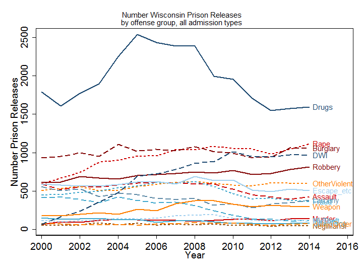
Prison releases are as important as admissions in determining the numbers in prison. The graphs a steady increase in releases from prison for rape and DWI, which led to net declines for these offenses after 2007, as well as a slow increase in murder releases which was not enough to offset the increase in murder admissions, while the releases for most other offenses generally followed a similar pattern to admissions.
We can calculate the net change in the number in prison by offense by subtracting releases from admissions. The graph below shows the total net change in red as well as the net change by offense. Although hard to read, it does tell a story: the solid dark blue line is drugs, and in most years the rise or fall in total imprisonment largely tracked the rise or fall in the number imprisoned for drugs. 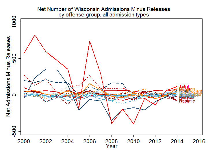
The most important exception is 2006-7, when the number of drug offenders in prison declined (but not as much as in 2005 or 2008) while the numbers rose for other offense groups, especially rape, weapons, and DWI. The years of greatest decline in imprisonment were 2008-2010; the rate of decline lessened after 2010 and the net change turned positive, although still small, in 2013. This graph thus suggests that the main factor driving the rise, decline, and new rise in imprisonment is the prosecution of the drug war. The total net change is not always exactly equal to the net change for drugs, but the changes for other offenses tend to be much lower and cancel each other out in most years.
Two years do not constitute a trend and I do not have more recent data, but focusing on the last three years in the series allows us to see what offenses were represented in the post-2012 uptick.
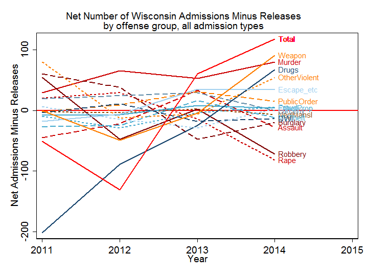
Murder continued to add to the prison population as it did every year from 2000 to 2014. The changes from negative to positive net change were for drugs, weapons charges, “other violent” and escape. On the other hand, the numbers in prison for robbery and rape declined, and the net contributions were negative for other serious offenses, including assault, burglary, negligent manslaughter and DWI. The 2013-4 uptick shows no evidence of any systematic effect of crimes that go into the violent crime index.
In the appendix to the full report , I show the complexity of the trends by admission type and offense. For many offenses, the numbers in prison are driven not by new commitments, but by churning in and out of prison through revocations. For others, especially murder, the growing number in prison is the steady accumulation of people who enter but mostly do not get out.
Policies directed toward reducing incarceration (or toward defending mass incarceration) need to avoid gross generalizations and look closely at the mix of new sentences and revocations by offense group.
Further work will show how these trends vary by race and place.
Thank you for this report. I am curious how many incarcerations are for crimes perpetrated on women. I can assume women are the victims of most rapes, but what about murder? Fraud? Family crimes? What picture would we see?
It is a good question to ask about gender, but I have not done that analysis yet. It requires backing up and re-doing the whole analysis process, which I have not gotten around to yet. Thank you for commenting. If I get your question answered, I can let you know via email.
I wonder what the release rates are for children that were convicted in adult court. I would really like to see the numbers and if the children that had meaningful releases. I know that Wisconsin has given life without parole to children as young as 13 years old. 400 of these children are still in sitting in prison after 25-30-40 years. This issue really needs to be addressed.
This is also a good question that I have not run the data on. Because I am always working with old data, a better way to go after this would be to file a FOIA directly with DOC. The data I have would show everyone who was in prison as of the year 2000, but has no names. I tried to answer this question with public data available from ICPSR but they suppress information about people admitted before age 18 because of identification issues.