
 Unremarked until very recently* , there is a hidden story to be told about the rise in White incarceration in the United States to supplement the story about the mass incarceration of Black people I and many others have been writing about for years. The White story has been going on outside the large metropolitan areas. Nationally, the Black rate of imprisonment leveled off after the late 1990s and then declined after the mid-2000s, while the White rate continued to climb. Underneath this national pattern is the fact that there were different trends in different kinds of places. Because the racial disparity in incarceration is so high, the single largest factor explaining the total incarceration rate in the US is the proportion of the population who are Black. But if you dig into the race-specific incarceration rates, you get a much different picture about incarceration. This post uses information from my longer paper Prison Sentence Trends by Area Type: 1985-2001 supplemented by information about 2000-2013. UPDATE: The newer analysis is now available in a working paper posted on SocArXiv.
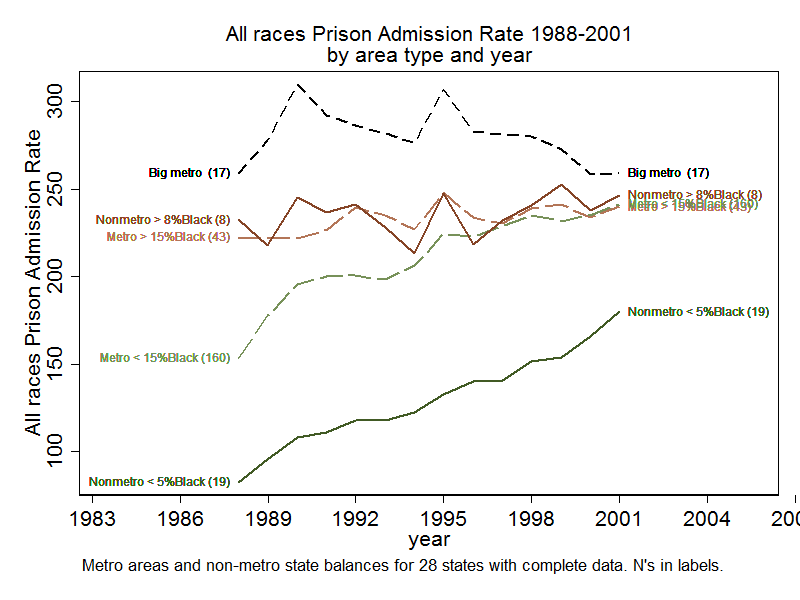
I got into studying this question after a reviewer of a draft of my still-unpublished** work on mass incarceration asked: what happened to White people? I didn’t know, so I had to do a lot of work and analysis to find out. I discovered a trend no one else had noticed, that White incarceration in overwhelmingly-White rural areas had been rising steeply throughout the 1990s. White incarceration was also rising in overwhelmingly-White smaller urban areas that lacked substantial Black populations. Although Black imprisonment rates were also rising in these places, very few Black people live in them, and the national Black rates were dominated by the downward trends in a few large metropolitan areas. However, a substantial fraction of White people do live in these White-dominated places outside the major metropolitan areas, and these places were the source of the upward White incarceration trend in this period in the 1990s.
My classification of places in this older analysis was crude and I have been working to generate improved data to pin down exactly what was happening both in the 1990s and since 2000. Here I show the trends I spotted for the 1990s and use roughly comparable classifications to show the same trends in more recent data. At the bottom of this post, under the methods details, are graphs that show these line graphs overlaid on the scatterplots, so you can see the size of these differences against the full range of variation.
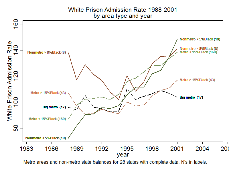
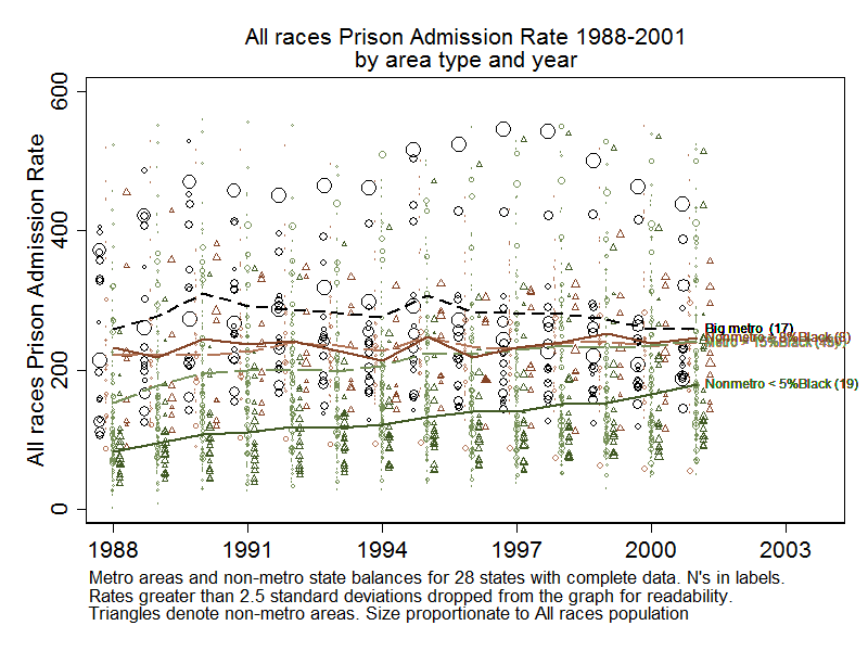
First we examine the 1988-2001 graph for Whites. There is a general upward trend in the White imprisonment rates across all area types. However, notice the steep rise in the imprisonment rates for Whites in non-metro areas that are less than 5% Black, where the rates go from the lowest to the highest in this period. The White imprisonment rates in the non-metro areas that are more than 8% Black were more consistently high. The White rate also grew almost as steeply in metro areas than were less than 15% Black. The growth in metro areas with large Black populations and where the percent Black was less than 15% was more modest. The metro areas that are large Black population centers had more modest growth in White imprisonment rates.
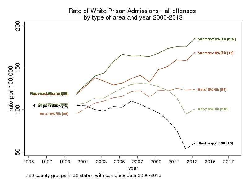
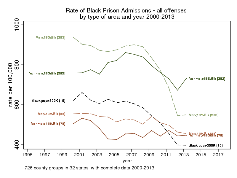
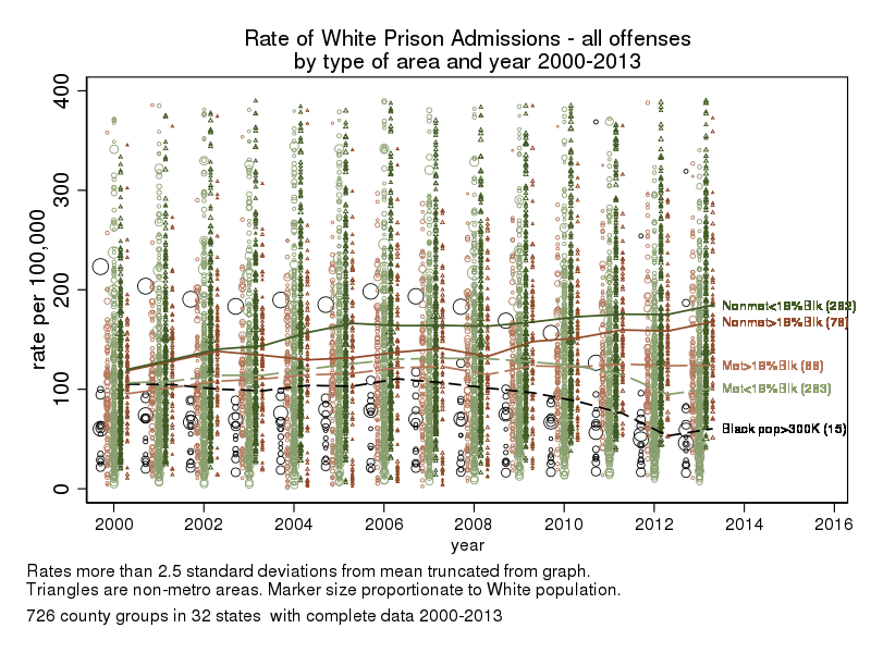
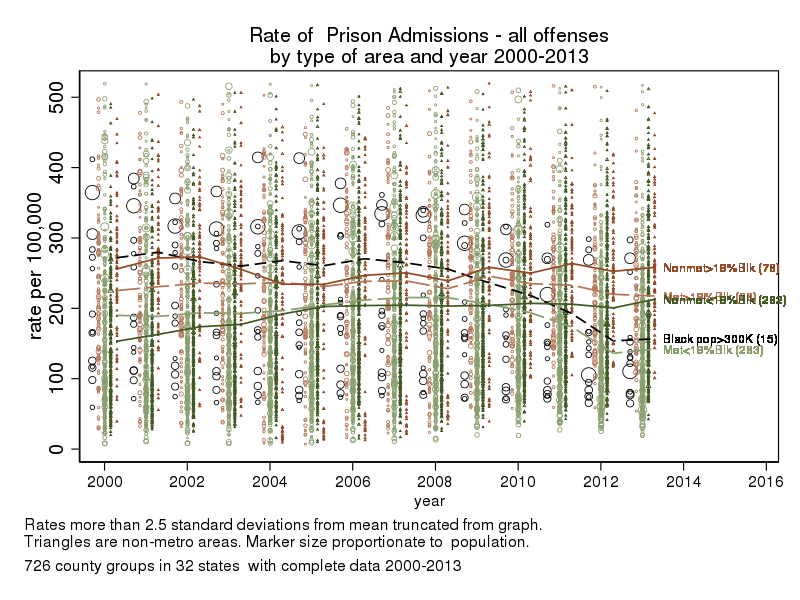
What about 2000-2013? In these data, the geographic units are smaller and more precisely defined. Here we see diverging trends. White prison admission rates continue to climb in non-metropolitan areas, regardless of racial composition, but there is a drop after 2008 in the large urban counties with more than 300,000 Black residents and also in the metro counties that are less than 19% Black.

Black rates show different patterns from White rates. The % Black is the biggest factor in the Black imprisonment rate. There is little difference in the metro and the non-metro rates for areas that have a substantial percent Black and they are substantially lower than the rates in the metro areas with smaller Black population proportions.
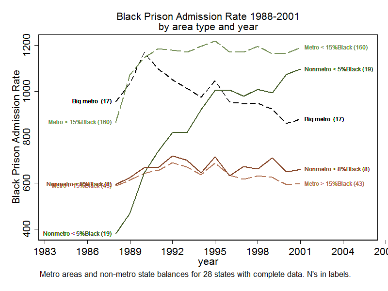
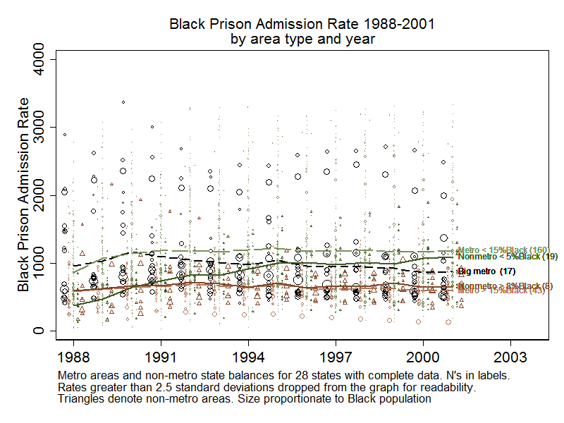
The highest average Black imprisonment was in smaller cities with small Black populations. Note that the Black rate fell substantially in in the 1990s in the 17 big metro areas with large Black populations. A large fraction of the Black population of the US lives in these areas and the national trend of a modest decline was dominated by these places. The Black rate in the overwhelmingly-White non-metro areas grew steeply, but there are very few Black people living in these areas, so this had only negligible effect on the national Black imprisonment rate.
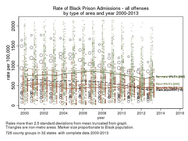
What about 2000-2013? Here where the units of aggregation are smaller and more sharply defined, we see the beginning of the series mirroring the end of the previous series, with the higher percent Black places having the lowest Black imprisonment rates. We also see a steep decline in the Black rate after 2007, especially in the metro areas with smaller percent Black; the rates in the large Black urban centers actually fall enough to end below the rates for the areas that are 19% or more Black.
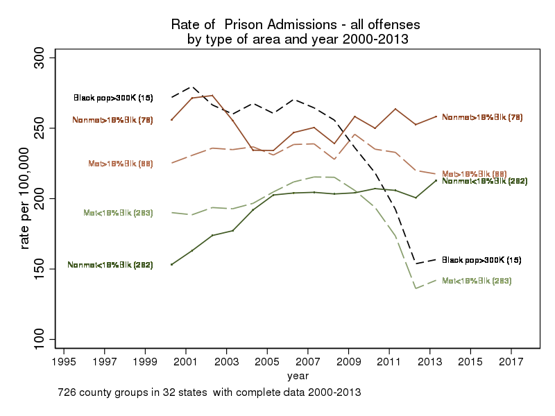
Notice that if you fail to disaggregate by race and just lump everyone together (as in the graph below), you get a composite graph that obscures what was going on. Here the top incarceration rates are for the large metropolitan areas and the places with a high percentage of Black people, although there is little growth in these places 1988-2001; incarceration rates are lower but rising in the places that have fewer Black people, with the rate for metro areas that are less than 15% Black catching up to the high percent Black areas by the end of the series.
Looking at 2000-2010, you again would see areas with a high percentage of Blacks having the highest rates, along with the large Black population centers, but then also see a steep decline in total imprisonment in the large urban areas and the urban areas that are less than 19% Black, and a more modest decline in the metro areas that have a higher percent Black. The trend in the overwhelmingly-White non-metro areas is generally upward, but not as steeply as in the race-specific graphs, and the trend in non-metro areas with larger Black populations goes down and then up.
Of course, these line graphs hide the fact that there is a great deal of variation around these differences, so as an appendix at the bottom of this post I also present the lines atop scatter plots to show how big these differences are against most of the full range of variation, although I did eliminate outliers that are more than 2.5 standard deviations above the mean. It is obvious from these scatter plots that this typology explains only part of the variation in Black or White imprisonment rates.
These graphs also examine only total prison admissions for all offenses. If attention is focused instead on new commitments, you get somewhat different patterns, because states vary markedly in the proportion of their prisoners who enter on revocations as well as in the proportion of the state that is rural. Similarly, different offense groups exhibit different patterns. Understanding imprisonment trends involves investigating a wide variety of factors. In a future post, I will show how education and poverty rates go a long way to account for the urban/rural differences in White incarceration, as well as show how the patterns vary somewhat by offense and admission type.
The data source is the restricted files of the National Corrections Reporting Program, which includes “county of sentencing” as a variable. For the 1988-2001 analysis, my research team was focused on Black incarceration and urban areas, so we grouped counties into metropolitan areas. The “non-metropolitan” areas are one for each state, the balance of counties were that were not in a metropolitan area. For 2000-2013, smaller counties are grouped to line up with the Public Use Micro Areas (PUMA) to facilitate merger with socio-economic factors, while larger counties are generally treated separately if they as large as or larger than a PUMA.***
In all cases, the time series graphs are based on places that had consistent data throughout the time period.*** The proportion Black used for classifying places is the average across the time period. The two series have a different mix of states in them that had complete data so the end of the first series is not comparable to the beginning of the second series, even though the dates overlap. Link to PDF table listing states included in this analysis.
UPDATE 7/15/17. I made errors in labeling the graphs I originally posted. The correct number of states in the new data is 32, not 23, the correct number of states in the old data is 28, not 27. There are only 27 non-metro areas because New Jersey is all metro in these data. The graphs have now been updated in the post.
* See Eason, John M., Danielle Zucker and Christopher Wildeman. 2017. “Mass Imprisonment across the Rural-Urban Interface.” The Annals of the American Academy of Political and Social Science 672(1):202-16. doi: doi:10.1177/0002716217705357; thanks to orgtheory.net for alerting me to this article. See also recent news coverage of rural incarceration in a 2016 New York Times article by Josh Keller and Adam Pearce.
** My failure to publish this analysis is a depressing story of perfectionism gone amok.
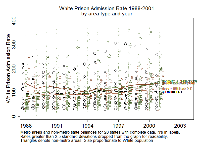
*** The restricted version of the NCRP includes county of sentencing. The analysis for 1988-2001 was for 25 states that had consistent-enough NCRP data for analysis including interpolations for intermediate years with missing data, and consistent county codes, and for 32 states that had consistent data for 2000-2013. In the 1988-2001 data, counties are grouped into metropolitan areas and there is one non-metro area per state, the balance of all cases that were not in a metro area. In the 2000-2010 data, individual counties are included if they are large enough to be one or more Public Use Micro Areas (PUMAs) and otherwise counties are grouped to following PUMA definitions. The PUMA definitions for the 1990 and 2000 Census did not prioritize county boundaries, so there were cases in which I had to form approximations of county groups to PUMAs. Counties are classified by the Census as metropolitan if they are part of a metropolitan area; this classification changed over time for some counties. County groups may include both metropolitan and non-metropolitan counties. In this analysis, I classify as “non-metropolitan” a county group that is less than 10% metropolitan when averaging the scores for all the counties in the group. So the contrast is really between rural and non-rural. In a separate analysis, I found that the average White imprisonment rate for county groups that mixed metropolitan and non-metropolitan counties is intermediate between the fully-metropolitan and fully-rural averages.
Appendix: Line graphs from above are shown against scatter plots to allow inspection of the differences against the range of variation between places.
3 comments