
In a previous post, I showed how the White imprisonment rate rose in rural counties even as the Black and White imprisonment rates in metropolitan areas fell. In this post, I show that the White rural-urban difference in imprisonment is linked to the White rural-urban difference in poverty and education, while Black poverty and education are not strong predictors of Black imprisonment. The main post focuses on poverty; the graphs for education are at the bottom of the post. Update: The working paper based on this and related posts is now available from SocArXiv.
Whites
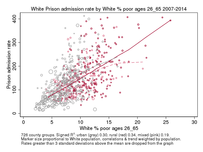
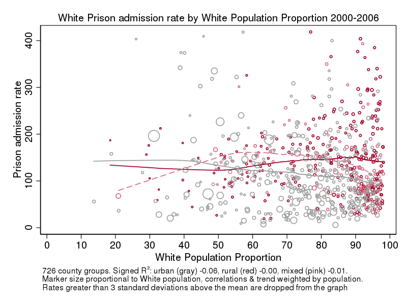
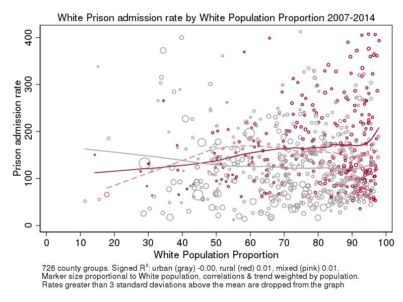
The first two graphs show the scatter plots and trend lines for the average White prison admission rate and the average White poverty rate for two eras: 2000-2006 and 2007-2014.* Notice the strong relation between urban vs. rural and the White poverty rate. There are many rural counties that have higher poverty rates than any urban county and many urban counties that have lower poverty rates than any rural county. The percent poor has a positive relation with the imprisonment rate within both urban and rural areas and the strength of this relation (as measured by the signed R2**) is higher in the second era than the first.
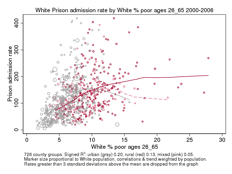

In the ranges of percent poor where there are both urban and rural areas, the average urban rate is higher than the average rural rate for 2007-14; this is also true for most of the overlap range in 2000-2006. In a statistical sense, this means that the percent poor “explains” the rural-urban difference in imprisonment rates for Whites. The rates of poverty and education are highly correlated with imprisonment rates among Whites and these, in turn, are highly correlated with the urban-rural difference. Further, the strength of this relationship seems to have increased over time.
Blacks
The patterns are different for Blacks. First, as the scattering of red and gray makes clear, high Black poverty is less concentrated in rural areas than for Whites. Second, an area’s Black poverty rate is less predictive of its Black imprisonment rate than for Whites. The correlation is positive for urban areas, but it is weakly negative for rural areas.
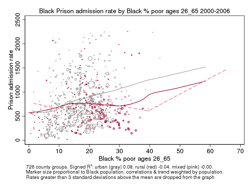
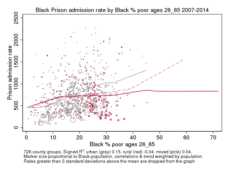
The Black scatter plots also suggest that there is an interaction effect between urban and Black poverty, with imprisonment rates being higher in rural than urban areas where Black poverty is below 15%, but higher in urban than rural areas where Black poverty is higher than 15%.
Racial Mix of Populations
Instead of poverty, the stronger predictor of the Black imprisonment rate is the percent Black in an area, with a stronger relation for rural than urban areas.
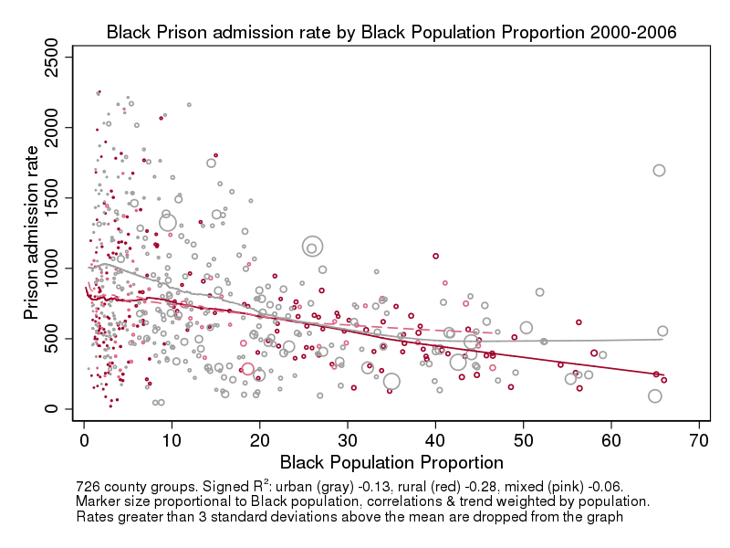
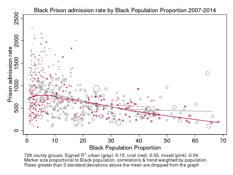
The outlier, the grey circle (large urban area) with a high Black prison admission rate and a higher percent Black (65%) is Baltimore County, Maryland. The large circle at 65% Black with a very low rate is Prince George’s County Maryland. The large gray circle that is about 25% Black with a high imprisonment rate is Cook County (Chicago) Illinois, and the large gray circle that is about 9% Black is Los Angeles County. New York City, the site if the largest Black population in the US is broken into 5 counties in these data as each borough is a county; the Bronx and Brooklyn (Kings Co.) are large circles just over 30% Black. The cluster of large circles just above 40% includes Detroit (Wayne Co.) and Philadelphia. The large pink circle at about 18% Black is Miami-Dade which also includes rural Monroe County due to the constraints of merging of imprisonment data with IPUMS data.
The racial mix of the population is not a strong factor for Whites. Notice that most of the very-White county groups are rural and that the White populations in the rural areas that are not overwhelmingly White are very small. The pink Miami-Dade circle is the only exception.
In a technical report, I include scatter plots showing comparable relations for education and the results of a multivariate regression that shows that controlling for poverty and education explains and reverses the rural/urban relation for Whites (i.e. after controlling for poverty & education, the White imprisonment rate is higher on average in urban areas). The regressions also show that the Black population percentage and the size of the Black population in combination are the biggest factors affecting the Black imprisonment rate and that rural Black imprisonment rates are lower than urban Black imprisonment rates both before and after controls.
With some exceptions, which I will document in future posts, Whites and Blacks generally had similar trends (rising or falling) with a given place, but because Blacks and Whites are distributed differently across places, the differences between places affect the national trends by race. Black people disproportionately live in large northern metropolitan counties with large Black populations or in southern cities and rural areas with a higher percentage Black population. Many White people also live in these large metropolitan counties, but a high percentage of Whites also live in overwhelmingly-White smaller cities and rural areas where almost no Blacks live, while very few Whites live in places that are a high percent Black.
Education
In this section, I use scatter plots for % less than high school and % college graduate to show that the patterns are similar to those for poverty.
Whites
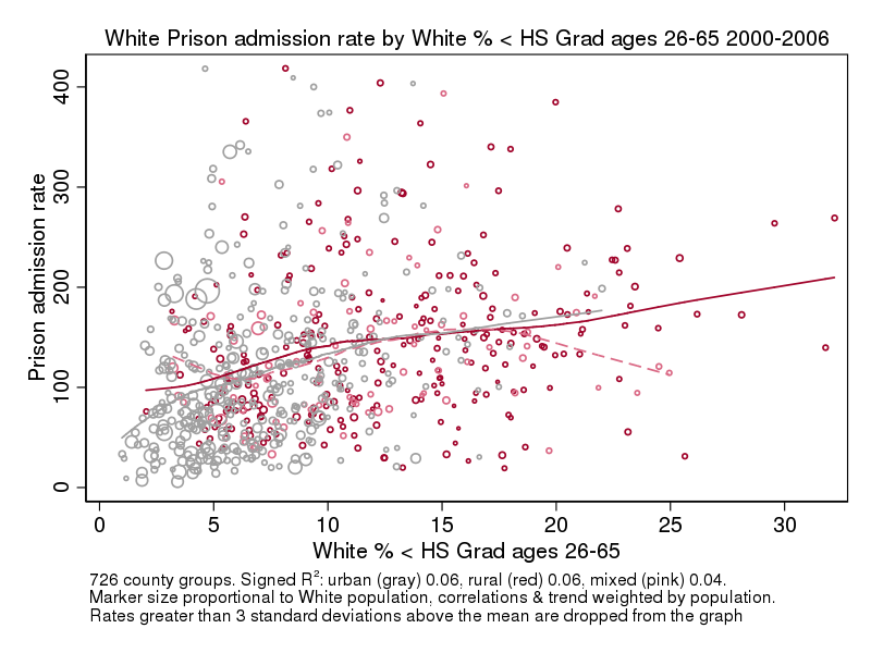
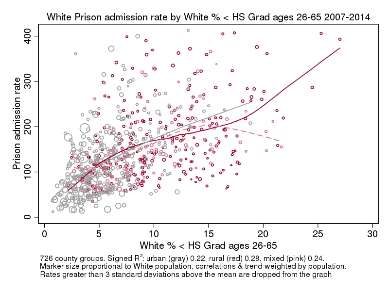
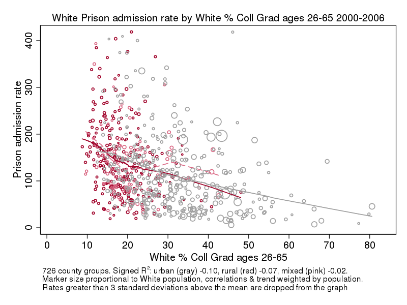
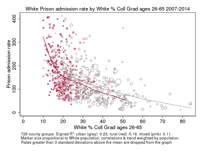
Overall there is very little urban-rural difference in the White imprisonment rate within places with comparable rates of high school drop outs or college graduates. There is also a broader range of overlap between urban and rural places at the unfavorable end of the education distribution (high rates of less than high school, low rates of college graduates), but almost no rural places at the favorable ends of these variables. The bivariate correlations for education are lower than those for poverty within rural/urban areas and, as with poverty, are higher in the later era than the earlier era.
Blacks
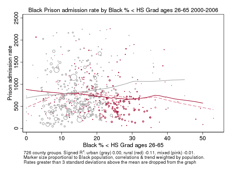
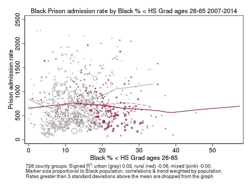
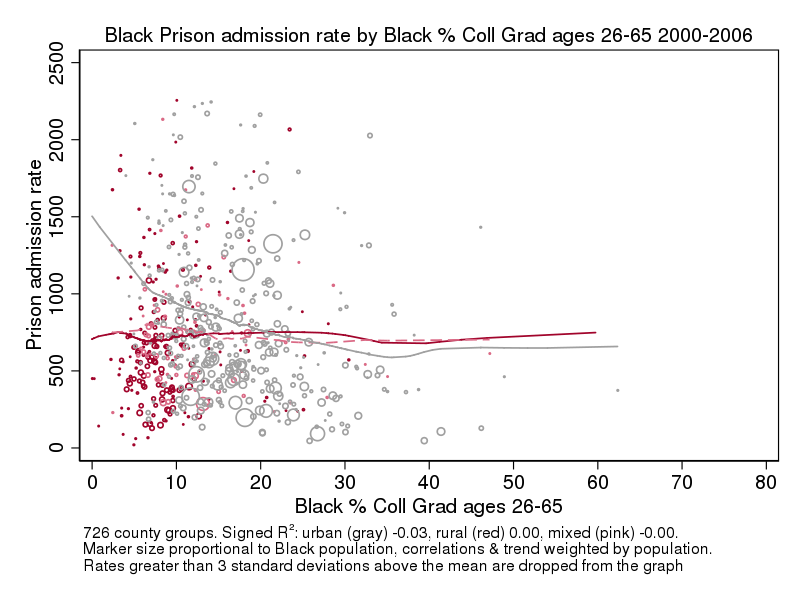
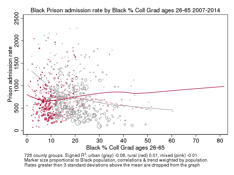
As for Whites, the favorable ends of the education distributions have very few rural areas, but unlike for White rates, the Black rates have very low correlations with education. The rates of imprisonment are higher for urban than rural areas at the unfavorable ends of the education distribution, but the rates are higher at the favorable ends.
* Poverty rates are available from Census IPUMS files from the 2000 Census and from samples 2007-2001. Rates for other years are interpolated or extrapolated from the available data. Prison admission frequencies are calculated from the restricted files of the National Corrections Reporting Program; county is county of sentencing; rates are calculated by dividing by the all-ages population of the racial group. These graphs are based on calculating the average imprisonment and poverty rates across the indicated period for each area. Only areas with full data for these years are included. Areas are either counties or groups of counties that align with Census Public use Micro Areas as defined from the 2000 Census.
** The signed R2 is the square of the bivariate correlation with the sign of the correlation added back. The magnitude of this number may be interpreted as the percent of the variation in one variable that is explained by the other, for example a signed R2 of .30 between White poverty and White imprisonment for urban areas in 2007-14 means that 30% of the variation in the rate of White imprisonment in urban areas in that era can be statistically explained by the poverty rate and the relation is positive (higher poverty goes with higher imprisonment); a signed R2 of -.35 for the relation between the Black population percentage and the Black imprisonment rate for rural areas in 2007-14 means that 35% of the variation in the Black imprisonment rate can be explained by the percent Black, and the relation is negative (lower percent Black goes with higher Black imprisonment).
One comment