UPDATE: CLICK HERE TO SEE THESE FIGURES FOR 1978-2013 in a later post
These graphs allow you to see the growth of state imprisonment 1978-2007, by race. I will have updated and error-checked data for 1978-2013 soon. Because I live in Wisconsin, I flagged the Wisconsin rates. These update at 1 year per second, slower than my last effort.
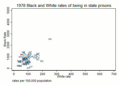
I am in the process of updating files but I realized that in the short run I could display the rise in state prison incarceration rates for Blacks and Whites over time, ending in 2007, nine years ago. These are the same data that I used for the “Clinton” post. Updated data are coming but the data cleaning process is slow. Very slow. I’m also re-cleaning these old data so some of the weird outliers in these plots might shift, although the basic pattern will not. Also I think I used adult population for these old rates, rather than total population. Again, this will not affect the pattern over time or the relative ranking of states, but does affect the rates themselves. The Black/White disparity is below the fold. Remember, the disparity is a function of the denominator (the White rate) not just the numerator (the Black rate).
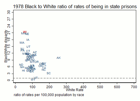
Here is the Black/White disparity. Notice that Wisconsin does not always have the highest disparity, although it is always near the top. The doted line at 1 is a reminder that this is Black/White equality: if the disparity ratio is below the line, the White rate is higher than the black rate.
And below for your edification the gifs for Hispanics and American Indians. First the rates, then the disparities.
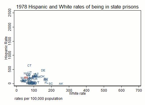
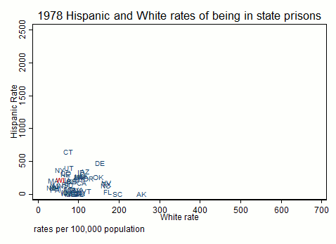
Here’s the Hispanic rate
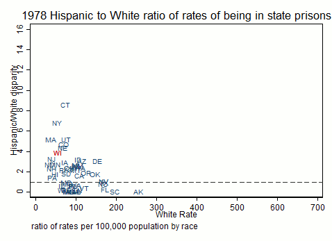
And here is the Hispanic disparity over time. Again the dotted line is equality of rates; a lot of states have disparity ratios below 1 (Hispanics have lower rates) which may be due to not actually counting Hispanics, or may be due to their relative absence in the state.
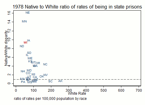
Here’s American Indian & Alaska Native rate
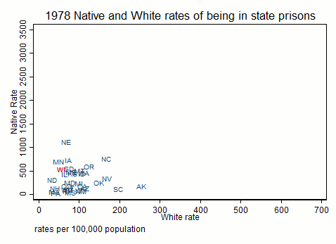
And the Native to White disparity. Again anything below the dotted line means that Whites have a higher rate than Native people. American Indians often go to federal court for offenses on reservations (and thus don’t show up in these data) and also have tribal courts which, again, may keep them out of state prison.
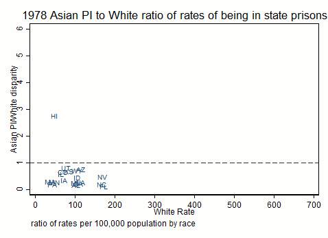
Here’s the Asian rate; note that the Asian rate is generally lower than the White rate and that the ranges of the two variables are similar.
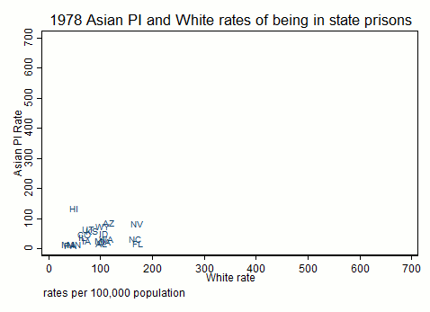
And the Asian/White disparity. Note that in most cases Whites have a higher rate of state imprisonment than Asians (disparity ratio below 1).