This page shows animated graphics for White, Black, Hispanic, American Indian, and Asian state imprisonment rates as they changed over time. It can get mesmerizing but studying the general patterns can reveal information that can inform theorizing. See methodological notes below. I used three-year moving averages to smooth out abrupt changes in rates than can happen for small populations.
Notice that the horizontal and vertical axes are different in each graph.
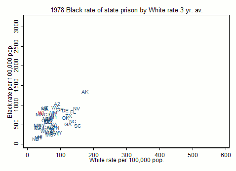
Black rate by the White rate. There is generally a positive correlation but the graph makes it clear that the correlation is modest.
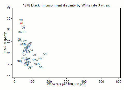
Black/white disparity by White rate. You divide by the White rate to calculate the disparity, so it is not surprising that the disparity is lower where the White rate is higher. There are some states that just lock everybody up at high rates, and other states that focus more on minorities.
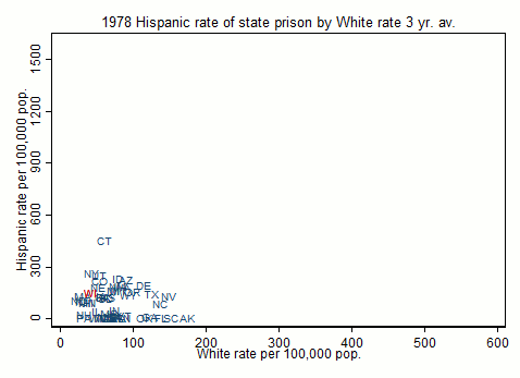
Hispanic rate by White rate
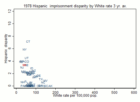
Hispanic/White disparity by White rate. The disparities are highest in the Northeast where Hispanics are predominantly Puerto Rican and Dominican.
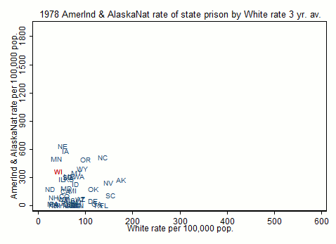
American Indian & Alaska Native rate by White rate. I’m puzzled by the relatively high position of Hawaii in this graph and wonder whether some Native Hawaiians (who have high incarceration rates) are getting counted as “Native American” by the Hawaiian prison system. Not much correlation here between the Native rate and the White rate.
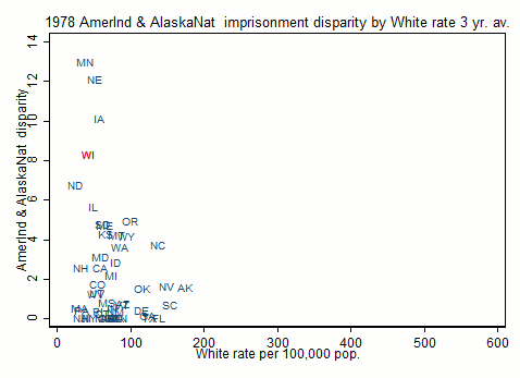
American Indian & Alaska Native disparity by White rate. A few Midwestern states really standout here, especially Minnesota.
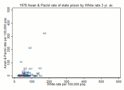
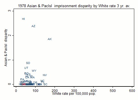
Asian & Pacific Islander rate by White rate. Note that Asian rate is usually lower than White rate and especially in early years is zero for many states, probably because they were not counted at all. Pacific Islanders have very high incarceration rates, but were not separated out in the older years. Hawaii’s high “Asian” rate is actually all Pacific Islanders, who are only separately enumerated after 2000. Asian Hawaiians have low rates.
And the Asian/White disparity. Note that it is usually lower than 1: Whites mostly have lower imprisonment rates than Asians.
Finally, I plot the minority/white disparity ratios against each other so you can see how states differ in their relative treatment of different minorities.
Methods Notes
These graphs were produced from National Prison Statistics data available from the Bureau of Justice Statistics via ICPSR. The raw data are very “dirty.” Hispanics are treated differently and inconsistently across time and between states, and comparisons of numbers for the same state across years reveal obvious errors. I had to make many decisions to “clean” these data, and other researchers might have made different decisions. The major decisions involved assigning a race to Hispanics. Prior to 2000, the “rules” entailed two counts, one for the number of inmates by race and the other for the number of Hispanic and non-Hispanic inmates. In some state/years, it was obvious that Hispanics had been counted as “race unknown” or “other race” while in other state/years Hispanics had been counted in the other racial groups, probably but not necessarily White. I generally assumed that the racial mix of Hispanics in a state’s prison system was the same as the racial mix of Hispanics in the state, an assumption that is not generally correct. Other cleaning decisions involved identifying obvious errors in the data and interpolating for missing information.
The population denominators are the total population, which includes children and old people.
I will be adding a link to a longer methodological appendix soon.
Originally published December 4, 2016.