3 One Variable
Load the libraries and data needed for this chapter. See Download the Data for links to the data.
library(ggplot2)
library(dplyr)

acs <- readRDS("acs.rds")
3.1 Discrete
3.1.1 Barplots
To understand the distribution of a discrete variable (a variable with a limited number of values or categories), we often want to know how the count of each category, that is, the number of observations at each level of the variable.
A barplot is useful for visualizing counts, and geom_bar() gives the count of each category by default (stat = "count").
ggplot(acs, aes(x = edu)) +
  geom_bar()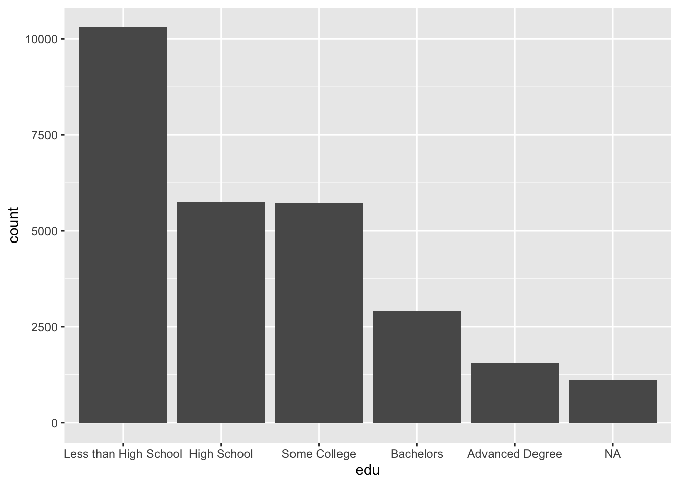
The above plot includes missing values (NA), which we can drop by making use of filter() and is.na().
Note that, while functions outside ggplot are linked with the pipe operator |>, ggplot elements are joined with the addition operator +.
ggplot has no separate function for horizontal barplots. Instead, supply the coord_flip() function to flip the horizontal and vertical coordinates, so that our x aesthetic is shown along the vertical axis.
acs |>
  filter(!is.na(edu)) |>
  ggplot(aes(x = edu)) +
  geom_bar() +
  coord_flip()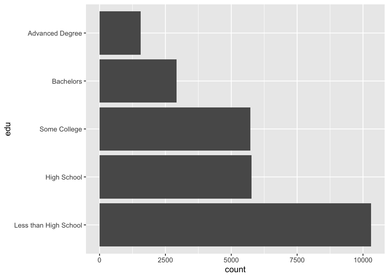
3.2 Continuous
3.2.1 Histograms
The standard histogram displays counts along a continuous variable, which is divided into a number of bins. The default number of bins in geom_histogram() is 30. With an age range of [0, 93], each bin is about 93 / 30 = 3.1 years wide.
A histogram that has been divided into discrete bins, or categories, is actually a barplot. In the barplots above, a continuous education variable was already divided into five “bins” of unequal width, something like 0-11 years of education (“Less than High School”), 12 years (“High School”), 13-15 years (“Some College”), 16 years (“Bachelors”), and 17+ years (“Advanced Degree”). In the histogram below, we divide our continuous age variable into 30 categories of equal width.
ggplot(acs, aes(x = age)) +
  geom_histogram()
## `stat_bin()` using `bins = 30`. Pick better value with `binwidth`.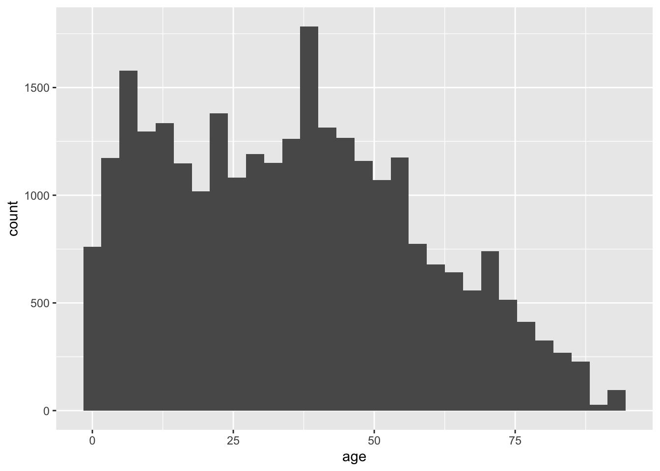
The width of each bin can be modified with the binwidth argument of geom_histogram(). We can set it to 10 so that the first bin is 0-10 years old, the second is 10-20, and so on.
ggplot(acs, aes(x = age)) +
  geom_histogram(binwidth = 10)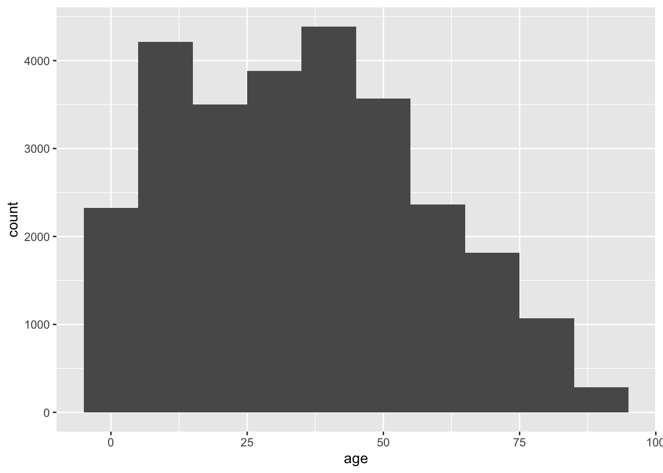
In the above plot, we lost a fair amount of information from the first histogram. The decrease in counts by age appears monotone after 50, but we know from the first histogram that there is a concentration of values (a peak) around 70.
Change binwidth to 1 for narrower bins, and so increase the amount of information in the plot.
ggplot(acs, aes(x = age)) +
  geom_histogram(binwidth = 1)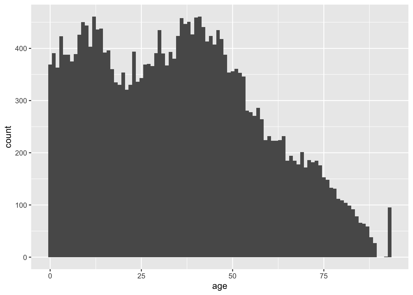
We now have the opposite problem as the previous plot. We have too much information, and we may be tempted to over-interpret fine differences in counts across adjacent values in age. We may choose to revert to the default of 30 bins for this variable.
Also, notice the relatively tall bar at the far right of the plot. Either age is top-coded somewhere in the 90s, or something very strange is happening in our sample.
3.2.2 Density Plots
Another choice for a single continous variable is a smoothed density plot, which can be created with geom_density().
ggplot(acs, aes(x = age)) +
  geom_density()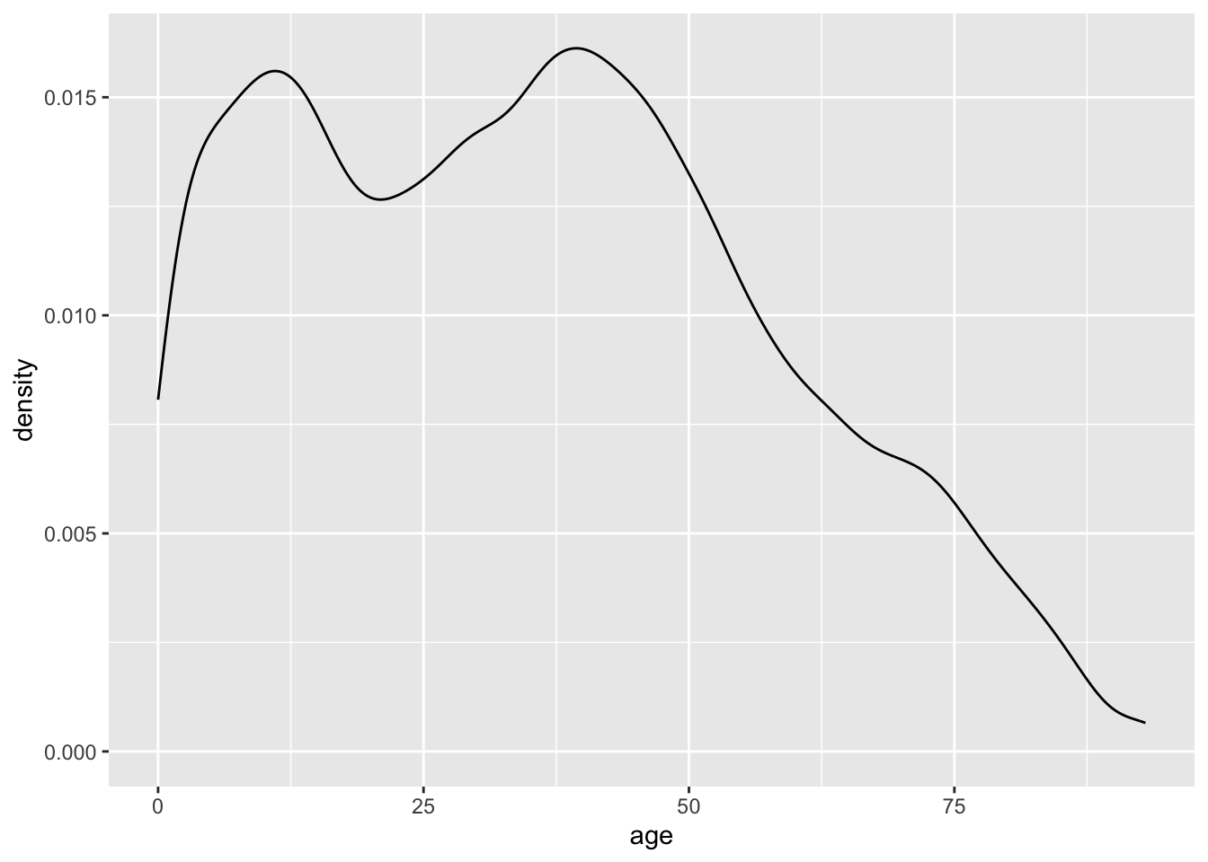
The height of the density plot is scaled so that the total area under the curve is equal to one, so the values on the y-axis have no practical meaning.
Just like how we adjusted the binwidth of our histograms, we can also adjust the granularity of density plots.
The bandwidth can be selected directly with the bw argument, but it may be easier to supply the adjust argument with a constant, which ggplot will multiple against the bandwidth.
A smaller bandwidth makes a more jagged plot. Too small of a bandwidth, and the density plot starts to look like a histogram.
ggplot(acs, aes(x = age)) +
  geom_density(adjust = .2)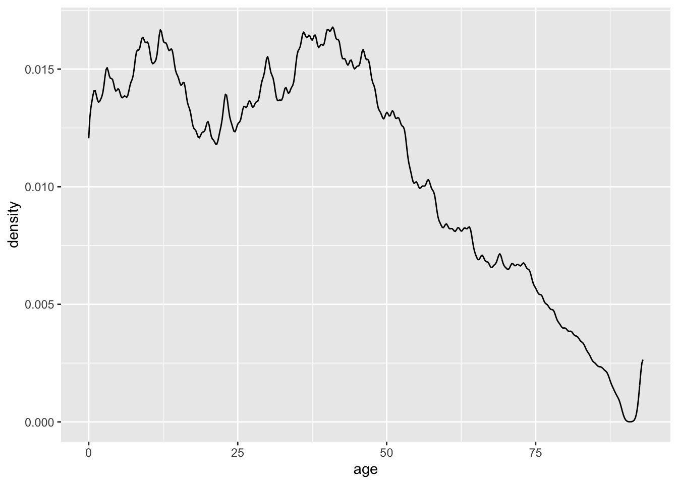
As with the histogram binwidths, if the density plot bandwidth is too large, too much information is lost.
ggplot(acs, aes(x = age)) +
  geom_density(adjust = 5)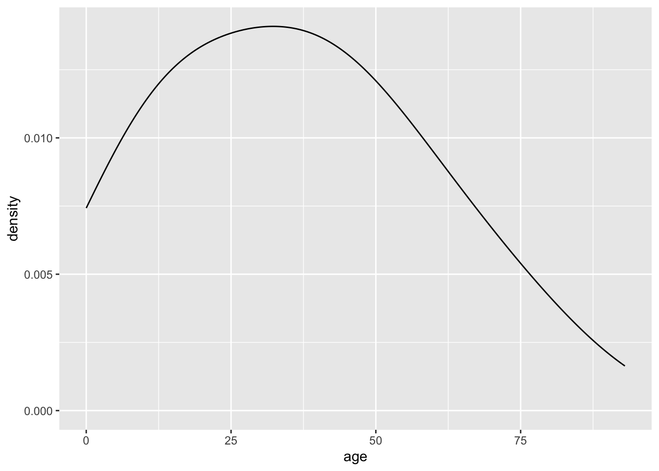
Usually, the default strikes a good balance.