2 ggplot Building Blocks
Load the libraries and data needed for this chapter. See Download the Data for links to the data.
library(ggplot2)

acs <- readRDS("acs.rds")
acs_small <- readRDS("acs_small.rds")
Load acs_small and the ggplot2 library.
What is a plot? A plot is a layered visualization of data, where visible properties such as location, size, or color represent values, which are either in or derived from our dataset.
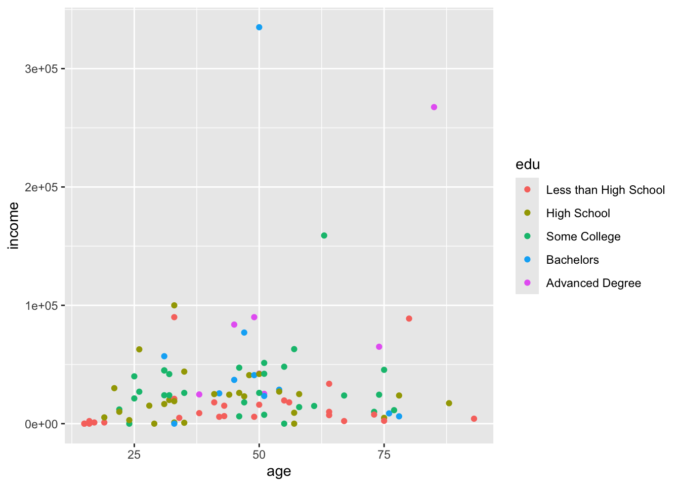
The plot below is a scatterplot of income by age for several levels of education. Three visible properties represent values: the horizontal position represents age, the vertical position represents income, and the color represents education level.
A plot can be decomposed into at least four elements:
- data, the dataframe
- aesthetic mappings, meaning which variable (
age,income,race, etc.) maps to which aesthetic (visible properties like x coordinates, y coordinates, color, shape, etc.) - coordinate system, the positioning system of points
- geom, short for geometric objects, such as lines or points
For a discussion of how plots can be further broken down into more elements, read Hadley Wickham’s A Layered Grammar of Graphics.
It is instructive to see these elements added in turn.
When we supply ggplot() with our dataframe, ggplot understands we want to use the acs dataset, but it does not know how the plot should relate to the data, so we are given a blank plot:
ggplot(acs)
Adding aesthetic mappings in the aes (short for aesthetic) argument gives rise to an axis label and vertical gridlines. At this point, ggplot knows there should be an x-axis that shows the edu variable, but it does not know how to represent the data:
ggplot(acs, aes(x = edu))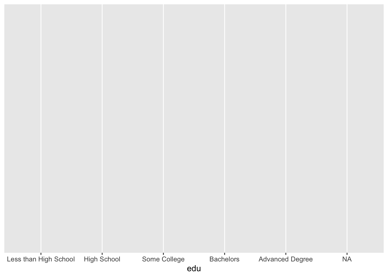
The default coordinate system is Cartesian coordinates (x, y).
Once a geom is supplied with any one of the many geom_*() functions, ggplot knows enough to create a useful plot. A geom_*() function is added to the ggplot() call with the addition operator +. You can use + to add additional geoms or other plot elements.
While the aesthetic mappings were supplied to ggplot(), these can also be given to the geom_*() function. If you supply aesthetics to geom_*(), they will only apply to that geom_*(), and not any others you include. Usually, you will want to specify your aesthetics within ggplot(), which then passes this on to all geom_*() functions (unless you specify inherit.aes = FALSE within a geom_*() function).
ggplot(acs, aes(x = edu)) +
  geom_bar()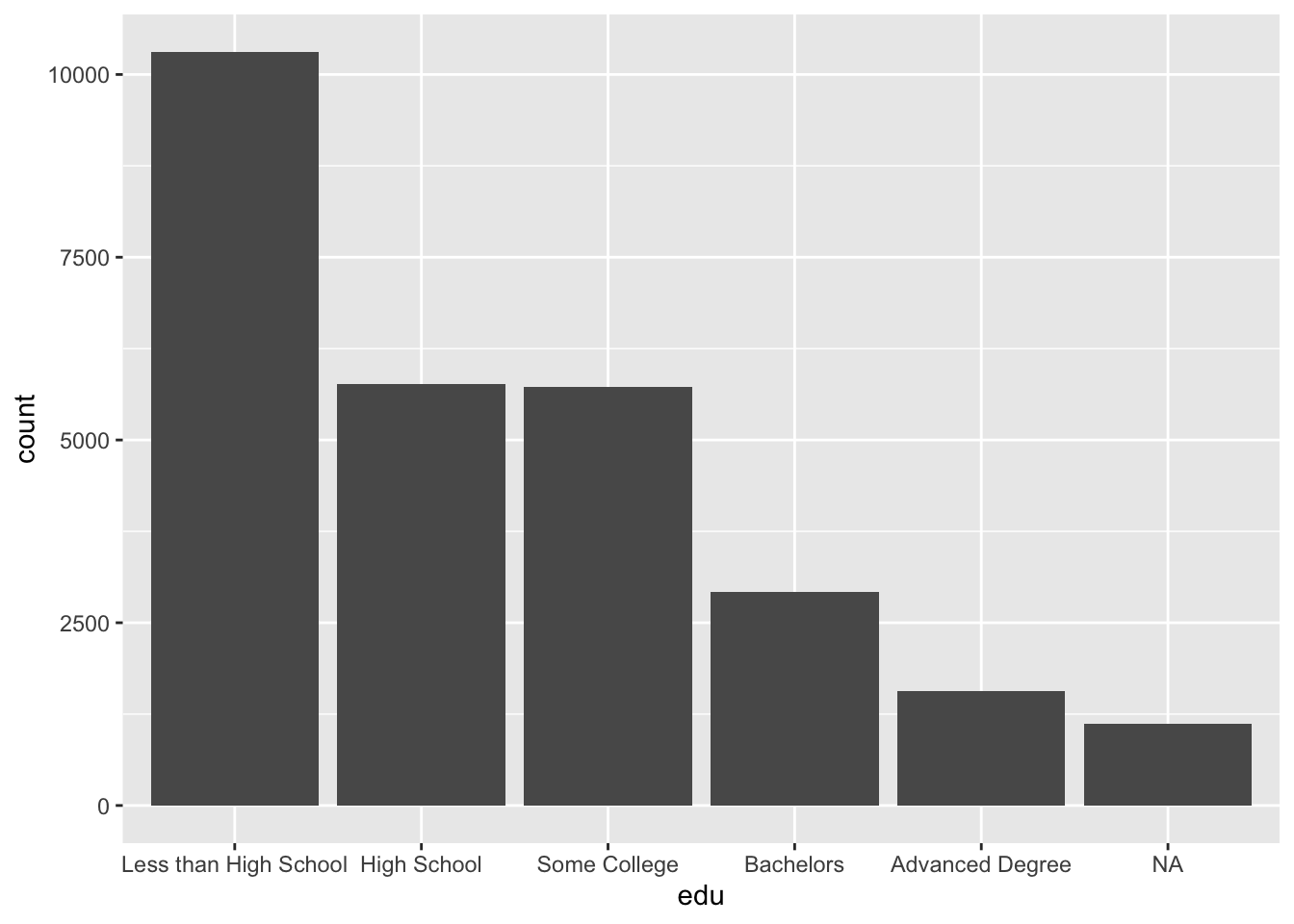
Returning to the definition of a plot from earlier, the values in this plot (counts by category) were not directly in the dataset, but rather they were derived from the dataset. This leads into an alternate way we can conceive of and build plots, which is by using stat_*(). Each geom_*() is associated with a default statistic, and each stat_*() is associated with a default geom. The default of geom_bar(), if we look at the documentation, is stat = "count", meaning that the bar lengths correspond to counts for each category in the x aesthetic. (ggplot performed a behind-the-scenes data summary.) The default geom of stat_count() is geom = "bar", so the counts calculated by this function will determine the length of the corresponding bars. Since these two functions have each other as defaults, we can reproduce the above plot with stat_count() instead of geom_bar().
ggplot(acs, aes(x = edu)) +
  stat_count()
You can build plots either way. You may choose to think about how you want your plot to look and start with geom_*(), or you may first think of what values you want to be displayed and use stat_*(), adjusting the function arguments as needed. I prefer to start with geom_*() and modify the stat = argument when I need to do so, and the examples that follow will reflect that.
Multiple geoms or stats can be supplied, each one added on top of the previous layers, and each one can be supplied with its own aesthetics.
The following plot serves only to show that geoms can be layered. Other than that, it is a hard-to-interpret plot with overlapping, poorly sized geoms. Look at the order of the arguments. Later layers are on top, where higher (later) layers cover up lower (earlier) layers. The blue line from geom_smooth() appears on top of the dashed yellow line from geom_hline(), which appears on top of the black points from geom_point(), which in turn appears on top of the dotted red line from geom_abline().
ggplot(acs, aes(x = age, y = log(income))) +
  geom_abline(color = "red", intercept = 7, slope = .05, size = 3, linetype = 3) +
  geom_point() +
  geom_hline(color = "gold", yintercept = 10, size = 3, linetype = 2) +
  geom_smooth(se = F, size = 3)
## `geom_smooth()` using method = 'gam' and formula = 'y ~ s(x, bs = "cs")'## Warning: Removed 8752 rows containing non-finite outside the scale range (`stat_smooth()`).## Warning: Removed 6173 rows containing missing values or values outside the scale range (`geom_point()`).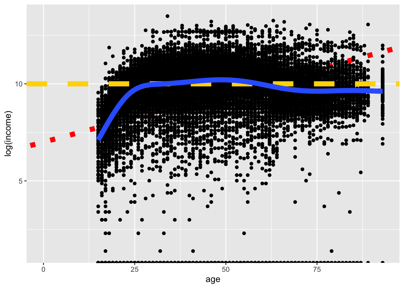
Now that we understand how to create a basic plot with ggplot, we can accomplish our real task: using data visualization to understand and communicate variable distributions. We will first look at how to visualize single-variable distributions, and then we will plot the relationships between two or more variables.