 Supporting Statistical Analysis for Research
4.1 Preparatory exercises
The skills in these exercise are used in the exercises at the end of the discourses of this chapter. Take a moment and complete these to confirm that you are prepared for this chapter. If these exercises are difficult, review the prior chapters.
Import the
PSID.csvdata set.library(tidyverse)psid_path <- file.path("..", "datasets", "PSID.csv") psid <- read_csv(psid_path, col_types = cols())Warning: Missing column names filled in: 'X1' [1]glimpse(psid)Observations: 4,856 Variables: 9 $ X1 <dbl> 1, 2, 3, 4, 5, 6, 7, 8, 9, 10, 11, 12, 13, 14, 15, 16... $ intnum <dbl> 4, 4, 4, 4, 5, 6, 6, 7, 7, 7, 10, 10, 10, 11, 13, 13,... $ persnum <dbl> 4, 6, 7, 173, 2, 4, 172, 4, 170, 171, 3, 171, 178, 17... $ age <dbl> 39, 35, 33, 39, 47, 44, 38, 38, 39, 37, 48, 47, 40, 3... $ educatn <dbl> 12, 12, 12, 10, 9, 12, 16, 9, 12, 11, 13, 12, 12, 16,... $ earnings <dbl> 77250, 12000, 8000, 15000, 6500, 6500, 7000, 5000, 21... $ hours <dbl> 2940, 2040, 693, 1904, 1683, 2024, 1144, 2080, 2575, ... $ kids <dbl> 2, 2, 1, 2, 5, 2, 3, 4, 3, 5, 98, 3, 0, 0, 2, 0, 0, 1... $ married <chr> "married", "divorced", "married", "married", "married...Plot
earningsversehours.ggplot(psid, aes(x = hours, y = earnings)) + geom_point() + theme_bw()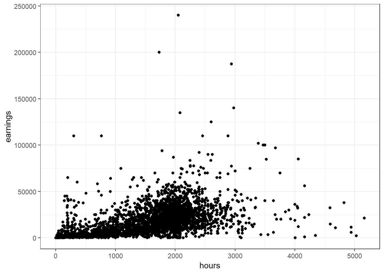
Make a boxplot of
earningswith separate boxplots for eachmarriedstatus.ggplot(psid, aes(x = married, y = earnings)) + geom_boxplot() + theme_bw()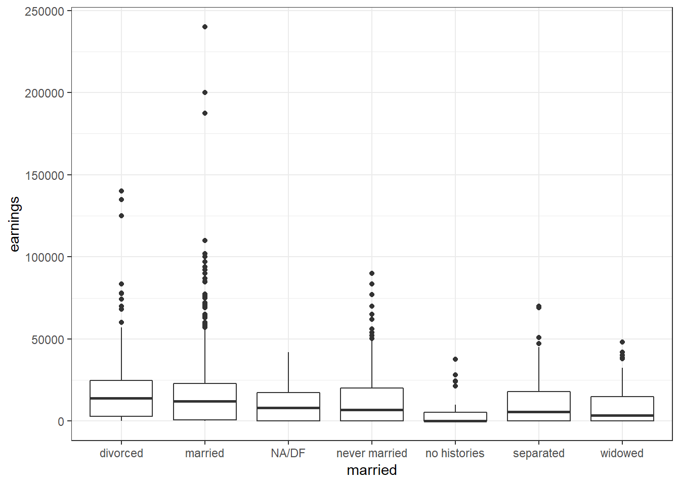
Make a horizontal boxplot of
earningswith separate boxplots for eachmarriedstatus.This should be the same plot as in the prior example only the earnings are displayed on the horizontal axis.
This is useful when there are many boxplots or the category names are long.
ggplot(psid, aes(x = married, y = earnings)) +
  geom_boxplot() +
  coord_flip() +
  theme_bw()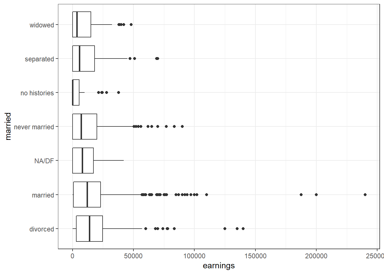
Do all of the categories of married make sense?
The
NA/DFandno historieswould make more sense being combined into a single set ofNAobservations.Plot
earningsversekids.ggplot(psid, aes(x = kids, y = earnings)) + geom_point() + theme_bw()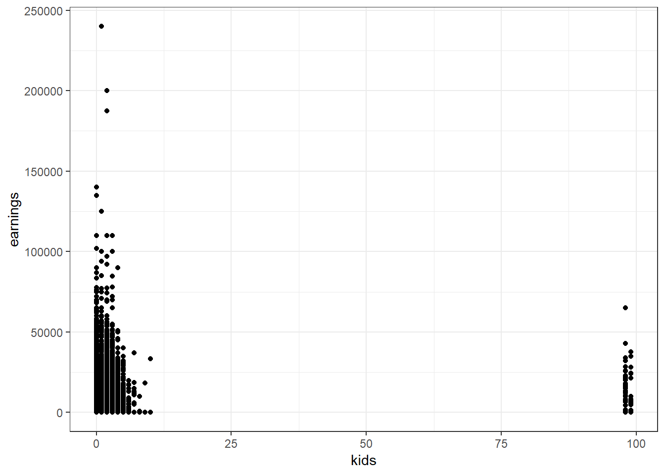
What can be learned from this plot?
There appears to a number of observations that have ankidsvalue of over- These are likely a code for
NA.
This would be more informative if earnings were displayed as a boxplot for each number of
kids.- These are likely a code for