This article is part of the Stata for Students series. If you are new to Stata we strongly recommend reading all the articles in the Stata Basics section.
Histograms are a very useful graphical tool for understanding the distribution of a variable. They can be used for both categorical and quantitative variables. This section will teach you how to make histograms; Using Graphs discusses what you can do with a graph once you've made it, such as printing it, adding it to a Word document, etc.
Setting Up
If you plan to carry out the examples in this article, make sure you've downloaded the GSS sample to your U:\SFS folder as described in Managing Stata Files. Then create a do file called hist.do in that folder as described in Doing Your Work Using Do Files and start with the following code:
capture log close
log using hist.log, replace
clear all
set more off
use gss_sample
// do work here
log close
If you plan on applying what you learn directly to your homework, create a similar do file but have it load the data set used for your assignment.
Creating Histograms
The command to create a histogram is just histogram, which can be abbreviated hist. It is followed by the name of the variable you want it to act on:
hist educ
This produces:
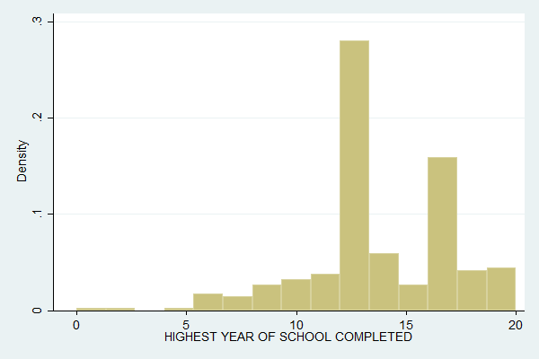
The y-axis is labeled as Density because Stata likes to think of a histogram as an approximation to a probability density function. You can change the Y-axis to count the number of observations in each bin with the frequency (or freq) option:
hist educ, freq
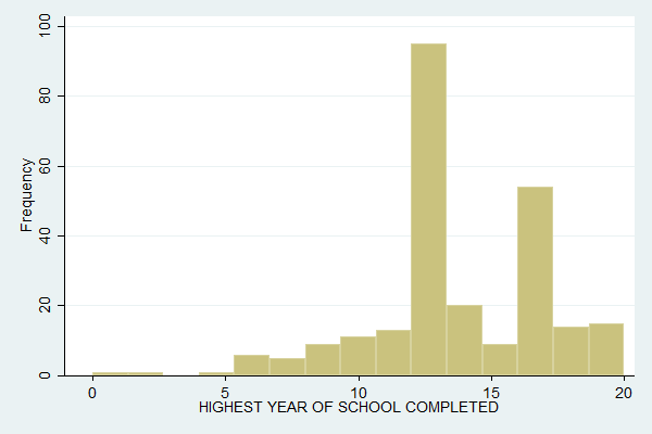
Percentages (percent) is another popular option. Note how the shape of the histogram is the same no matter how the Y-axis is labeled.
You can control how many "bins" the data are divided into with the bin() option, putting the desired number of bins in the parentheses. Compare the above with:
hist educ, freq bin(8)
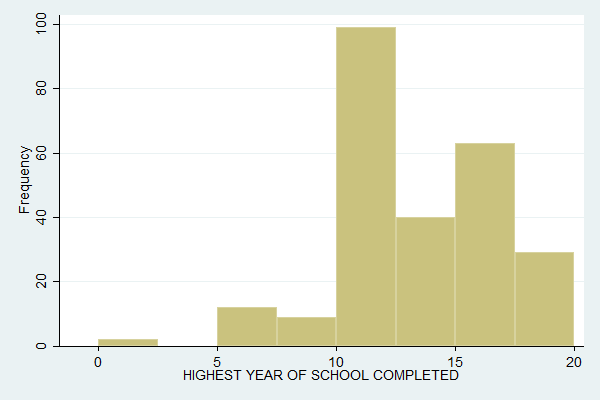
You can miss features of the data by not using enough bins. For example, with the default 15 bins we can see that people are more likely to drop out of college in the first half of their college career than the second, but this is not visible with 8 bins.
For categorical variables, or quantitative variables that are integers and take on a fairly small number of values (educ qualifies with 20 values), the ideal is often to have one bin for each value. You can do this with the discrete option:
hist educ, freq discrete
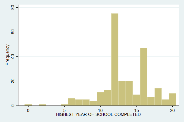
This further clarifies that what's really happening is that people are less likely to drop out in their last year of college.
There are many, many options you can set for histograms, such as titles and colors. The easy way to find all these options is to click Graphics, Histogram. Tweak the settings there until you get the graph you want, then copy the resulting command into your do file.
Complete Do File
The following is a complete do file for this section.
capture log close
log using hist.log, replace
clear all
set more off
use gss_sample
hist educ
hist educ, freq
hist educ, freq bin(8)
hist educ, freq discrete
log close
Last Revised: 7/21/2016