Box Plot. A quick visual inspection of a variable’s distribution can reveal some surprising features that are hidden by statistics, numerical summary measures. The box plot, also known as a “box and whiskers” plot, is one such graphical device. Figure 1.3 illustrates a box plot for the bodily injury claims. Here, the box captures the middle 50% of the data, with the three horizontal lines corresponding to the 75th, 50th and 25th percentiles, reading from top to bottom. The horizontal lines above and below the box are the “whiskers.” The upper whisker is 1.5 times the interquartile range (the difference between the 75th and 25th percentiles) above the 75th percentile. Similarly, the lower whisker is 1.5 times the interquartile range below the 25th percentile. Individual observations outside the whiskers are denoted by small circular plotting symbols, and are referred to as “outliers.”
Graphs are powerful tools; they allow analysts to readily visualize nonlinear relationships that are hard to comprehend when expressed verbally or by mathematical formula. However, by their very flexibility, graphs can also readily deceive the analyst. Chapter 21 will underscore this point. For example, Figure 1.4 is a re-drawing of Figure 1.2; the difference is that Figure 1.4 uses more, and finer, rectangles. This finer analysis reveals the asymmetric nature of the sample distribution that was not evident in Figure 1.2.
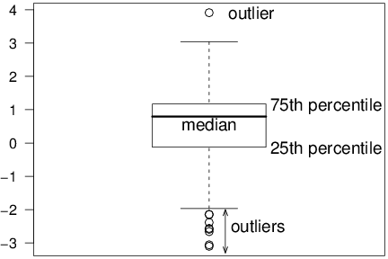
Figure 1.3. Box Plot of Bodily Injury Claims.
R Code for Figure 1.3
Quantile-Quantile Plots. Increasing the number of rectangles can unmask features that were not previously apparent; however, there are in general fewer observations per rectangle meaning that the uncertainty of the relative frequency estimate increases. This represents a trade-off. Instead of forcing the analyst to make an arbitrary decision about the number of rectangles, an alternative is to use a graphical device for comparing a distribution to another known as a quantile-quantile, or qq, plot.
Figure 1.5 illustrates a qq plot for the bodily injury data using the normal curve as a reference distribution. For each point, the vertical axis gives the quantile using the sample distribution. The horizontal axis gives the corresponding quantity using the normal curve. For example, earlier we considered the 75th percentile point. This point appears as (1.168, 0.675) on the graph. To interpret a (qq) plot, if the quantile points lie along the superimposed line, then the sample and the normal reference distribution have the same shape. (This line is defined by connecting the 75th and 25th percentiles.)
In Figure 1.5, the small sample percentiles are consistently smaller than the corresponding values from the standard normal, indicating that the distribution is skewed to the left. The difference in values at the ends of the distribution are due to the outliers noted earlier that could also be interpreted as the sample distribution having larger tails than the normal reference distribution.
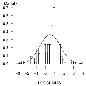
Figure 1.4. Re-drawing of Figure 1.2 with an increased number of rectangles.
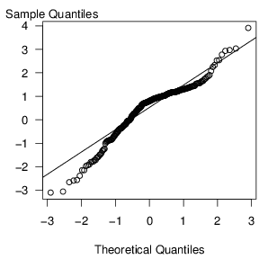
Figure 1.5. A (qq) plot of Bodily Injury Claims, using a normal reference distribution.