To illustrate, consider monthly returns over the five year period from January, 1986 to December, 1990, inclusive. Specifically, we use the security returns from the Lincoln National Insurance Corporation as the dependent variable (y) and the market returns from the index of the Standard & Poor’s 500 Index as the explanatory variable (x). At the time, the Lincoln was a large, multi-line, insurance company, headquartered in the midwest of the U.S., specifically in Fort Wayne, Indiana. Because it was well known for its’ prudent management and stability, it is a good company to begin our analysis of the relationship between the market and an individual stock.
We begin by interpreting some of basic summary statistics, in Table 2.8, in terms of financial theory. First, an investor in the Lincoln will be concerned that the five year average return, (overline{y})=0.00510, is below the return of the market, (overline{x} ). Students of interest theory recognize that monthly returns can be converted to an annual b=0.00741) as in using geometric compounding. For example, the annual return of the Lincoln is ((1.0051)^{12})-1=0.062946, or roughly 6.29 percent. This is compared to an annual return of 9.26% (= (100((1.00741)^{12}-1))) for the market. A measure of risk, or volatility, that is used in finance is the standard deviation. Thus, interpret (s_y) = 0.0859 (>) 0.05254 = (s_x) to mean that an investment in the Lincoln is riskier than that of the market. Another interesting aspect of Table 2.8 is that the smallest market return, -0.22052, is 4.338 standard deviations below its average ((-0.22052-0.00741)/0.05254 = -4.338). This is highly unusual with respect to a normal distribution.
begin{matrix}
begin{array}{c}
text{Table 2.8 Summary Statistics of 60 Monthly Observations}
end{array}\small
begin{array}{c|ccccc} hline & & & text{Standard} & \ & text{Mean} & text{Median} & text{Deviation} & text{Minimum} & text{Maximum}\ hline text{LINCOLN} & 0.0051 & 0.0075 & 0.0859 & -0.2803 & 0.3147 \ text{MARKET} & 0.0074 & 0.0142 & 0.0525 & -0.2205 & 0.1275 \ hline end{array}\scriptsize
begin{array}{l}Source: text{Center for Research on Security Prices, University of Chicago}phantom{X} \ hline end{array} end{matrix}
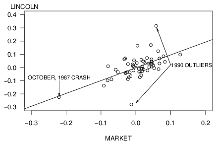
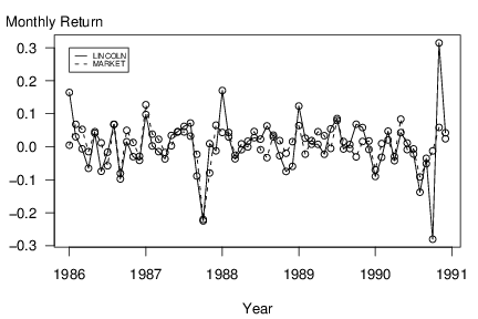
We next examine the data over time, as is given graphically in Figure 2.9. These are scatter plots of the returns versus time, called time series plots. In Figure 2.9, one can clearly see the smallest market return and a quick glance at the horizontal axis reveals that this unusual point is in October, 1987, the time of the well-known market crash.
R Code for Figure 2.9
The scatter plot in Figure 2.10 graphically summarizes the relationship between Lincoln’s return and the return of the market. The market crash is clearly evident in Figure 2.10 and represents a high leverage point. With the regression line (described below) superimposed, the two outlying points that can be seen in Figure 2.9 are also evident. Despite these anomalies, the plot in Figure 2.10 does suggest that there is a linear relationship between Lincoln and market returns.