- Calculate and interpret a correlation coefficient
- Interpret correlation coefficients by visualizing related scatter plots
- Fit a line to data using the method of least squares
- Predict an observation using a least squares fitted line
Video Overview of the Section (Alternative .mp4 Version – 13:59 min)
Regression is about relationships. Specifically, we will study how two variables, an x and a y, are related. We want to be able to answer questions such as, if we change the level of x, what will happen to the level of y? If we compare two “subjects” that appear similar except for the x measurement, how will their y measurements differ? Understanding relationships among variables is critical for quantitative management, particularly in actuarial science where uncertainty is so prevalent.
It is helpful to work with a specific example to become familiar with key concepts. Analysis of lottery sales has not been part of traditional actuarial practice but it is a growth area in which actuaries could contribute.
Example: Wisconsin Lottery Sales. State of Wisconsin lottery administrators are interested in assessing factors that affect lottery sales. Sales consists of online lottery tickets that are sold by selected retail establishments in Wisconsin. These tickets are generally priced at $1.00, so the number of tickets sold equals the lottery revenue. We analyze average lottery sales (SALES) over a forty-week period, April, 1998 through January, 1999, from fifty randomly selected areas identified by postal (ZIP) code within the state of Wisconsin.
Although many economic and demographic variables might influence sales, our first analysis focuses on population (POP) as a key determinant. Chapter 3 will show how to consider additional explanatory variables. Intuitively, it seems clear that geographic areas with more people will have higher sales. So, other things being equal, a larger x=POP means a larger y=SALES. However, the lottery is an important source of revenue for the state and we want to be as precise as possible.
A little additional notation will be useful subsequently. In this sample, there are fifty geographic areas and we use subscripts to identify each area. For example, $y_1$ = 1,285.4 represents sales for the first area in the sample that has population $x_1$ = 435. Call the ordered pair $(x_1, y_1)$ = (435, 1285.4) the first observation. Extending this notation, the entire sample containing fifty observations may be represented by $(x_1, y_1), …, (x_{50}, y_{50})$. The ellipses ( … ) mean that the pattern is continued until the final object is encountered. We will often speak of a generic member of the sample, referring to $(x_i, y_i)$ as the (i)th observation.
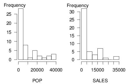
Data sets can get complicated, so it will help if you begin by working with each variable separately. The two panels in Figure 2.1 show histograms that give a quick visual impression of the distribution of each variable in isolation of the other. Table 2.1 provides corresponding numerical summaries. To illustrate, for the population variable (POP), we see that the area with the smallest number contained 280 people whereas the largest contained 39,098. The average, over 50 ZIP codes, was 9,311.04. For our second variable, sales were as low as \$189 and as high as \$33,181.
\begin{array}{c}
\text{Table 2.1 Summary Statistics of Each Variable}
\end{array} \\ \small
\begin{array}{lrrrrr} \hline & & & text{Standard} & & \\
\text{Variable} & \text{Mean} & \text{Median} & \text{Deviation} & \text{Minimum} & \text{Maximum} \\
\hline \text{POP} & 9,311 & 4,406 & 11,098 & 280 & 39,098 \\
\text{SALES} & 6,495 & 2,426 & 8,103 & 189 & 33,181 \end{array} \\ \hline \scriptsize
\begin{array}{c}
Source: Frees and Miller (2003).
\end{array}\end{matrix}
R Code for Table 2.1
As Table 2.1 shows, the basic summary statistics give useful ideas of the structure of key features of the data. After we understand the information in each variable in isolation of the other, we can begin exploring the relationship between the two variables.