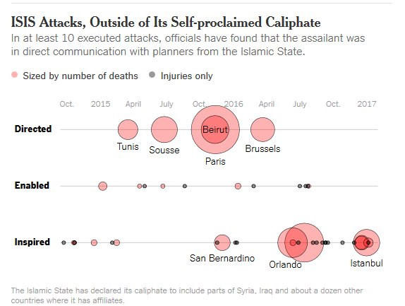
Data, Graphical Object, Level of Measurement
To get started in Stata, we need to think about what graphical objects we are using, what data defines their positions or aesthetic characteristics, and what level of measurement is used for our coordinates.
In this plot, each graphical object is a circle, centered on a point. Each point is positioned by time and type of terrorist attack. While time is a continuous variable, type of attack is categorical (perhaps ordered). Additionally, each point marker is sized in proportion to the number of people killed, and the color of each marker is determined by whether or not the attack killed some of its victims. We also have labels for some locations.
The location of circular markers as points narrows our focus to three Stata commands: graph dot, graph twoway dot, or graph twoway scatter.
The presence of a categorical coordinate, the type of attack, should suggest using graph dot. However, keep the twoway commands in mind, as twoway commands generally give us more options for customizing our graph.
Data
First we read in the data. We are given four variables: date, location, number of people killed, and the role of ISIS in the attack. We'll go ahead and convert human-readable dates (a string variable) into a numeric format suitable for graphing.
import delimited "NYTISIS/ISISattacks.csv"
generate attack = date(date, "MDY")
format %tdMon_dd,_CCYY attack
list in 1/5, noobs
  |       date                   location   dead       role         attack |
  |------------------------------------------------------------------------|
  | 10/20/2014   Saint-Jean-sur-Richelieu      1   Inspired   Oct 20, 2014 |
  | 12/15/2014                     Sydney      2   Inspired   Dec 15, 2014 |
  |   1/8/2015                      Paris      4    Enabled    Jan 8, 2015 |
  |  2/15/2015                 Copenhagen      2   Inspired   Feb 15, 2015 |
  |  3/18/2015                      Tunis     22   Directed   Mar 18, 2015 |
  +------------------------------------------------------------------------+
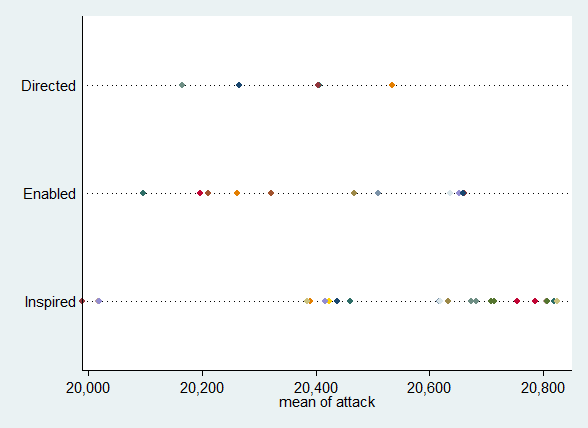
Graph Dot
A first try at graphing using graph dot is promising: we appear to have the right graphing object and coordinates.
graph dot attack, over(location) asyvars over(role) ///
    legend(off) exclude0
However, there are a number of problems here that will be difficult to overcome. One is that we have no option to resize the markers by another variable. A second problem is that marker colors are defined by location, not the number of deaths. A third problem is that the points are a mean attack date within locations, and because some locations occur more than once, we cannot switch to an "asis" date. Related to this, the time coordinate is not scaled in a way that makes sense to humans!
These limitations push us to use scatter instead.
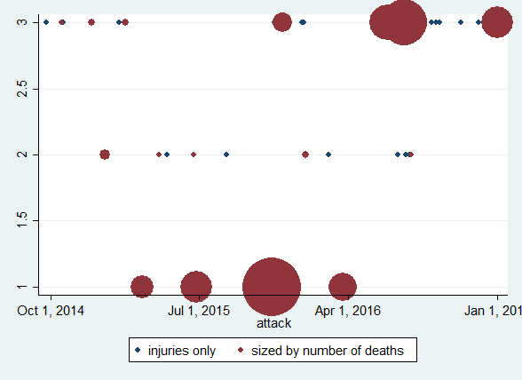
Twoway Scatter
We will need to do some additional data setup in order to use twoway scatter. Our categorical variable, role, will need to be encoded numerically. We will want deaths versus injuries as separate variables, so that we can use multiple y variables for color coding. And we want non-missing values for deaths in order to use that variable to set marker sizes.
We'll also set up some variable labels and value labels, which become textual guides of various sorts in our graph.
encode role, generate(ISIS) label(rolelbl)
separate ISIS, by(dead < .)
label variable ISIS0 "injuries only"
label variable ISIS1 "sized by number of deaths"
label values ISIS? rolelbl
replace dead = 1 if dead ==.
With this setup, the basic scatter command is fairly succinct.
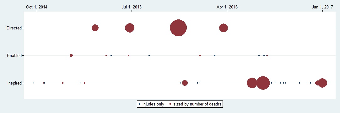
scatter ISIS? attack [w=dead]
Visually, this is only a little better than graph dot, but it clears up all of the problems identified above, and gives us a path to move forward.
Refinement Through Graph Options
Yscale
Better y coordinates and guide make it easier to see we are on the right track. (Note we cannot simply suppress the y-ticks if we have y-labels.)
We give ourselves more room for the markers with yscale(range()), reverse the direction of the coordinates to match the original graph, and add labels.
scatter ISIS? attack [w=dead], ///
    yscale(range(0.5 3.5) reverse noline) /*ytick(none)*/ ///
    ylabel(1(1)3, valuelabel angle(horizontal))
Xscale
A few similar options give us a better x axis and guide, and aspect ratio. We can suppress the variable name with xtitle(""), move the coordinates to the top with xscale(alt), extend the graphing area with tscale(range()) (which is like xscale, but for date-time data values). Finally, we set the aspect ratio with ysize() and xsize().
scatter ISIS? attack [w=dead], ///
    yscale(range(0.5 3.5) reverse noline) ///
    ylabel(1(1)3, valuelabel angle(horizontal)) ///
    xtitle("") xscale(alt noline) tscale(range(1Sep2014 1Feb2017)) ///
    ysize(2) xsize(6)
Our graph is beginning to shape up!
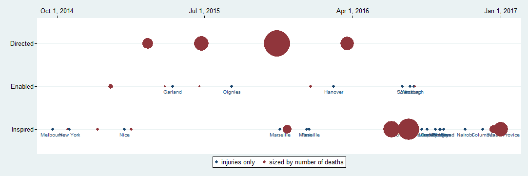
Marker Labels
Adding marker labels, however, poses something of a challenge. It turns out that in Stata, you cannot use both marker labels and marker weights in the same graph specification. If we try, we see that labels are ignored for y variables that have weights ~= 1.
scatter ISIS? attack [w=dead], ///
    yscale(range(0.5 3.5) reverse noline) ///
    ylabel(1(1)3, valuelabel angle(horizontal)) ///
    xtitle("") xscale(alt noline) tscale(range(1Sep2014 1Feb2017)) ///
    ysize(2) xsize(6) ///
    mlabel(location) mlabposition(6)
Here we lack the labels we want, and do not have the ones we do.
What we can do is overlay our plot with another plot that has just labels in it. This will require a little more data set up to get the labels positioned appropriately. Note the Beirut data point is not like the others!
generate isis2 = ISIS1 + 0.4 if location ~= "Beirut"
* And select just certain labels to use
generate location2 = location if dead >= 14
The second scatter does the work we need.
twoway (scatter ISIS1 ISIS0 attack [w=dead]) ///
    (scatter isis2 attack, ///
        msymbol(none) mlabel(location2) mlabposition(0)) ///
    , yscale(range(0.5 3.5) reverse noline) ///
    ylabel(1(1)3, valuelabel angle(horizontal)) ///
    xtitle("") xscale(alt noline) tscale(range(1Sep2014 1Feb2017)) ///
    ysize(2) xsize(6)
Here it is important that msymbol() and mlabel() are options to just the second scatter plot. They cannot be used with the first scatter plot, nor as global plot options.
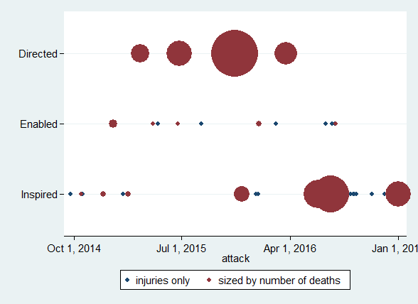
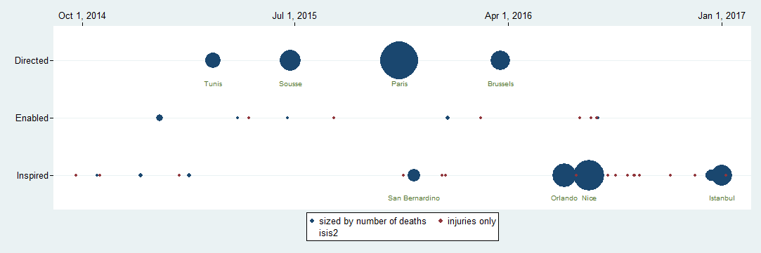
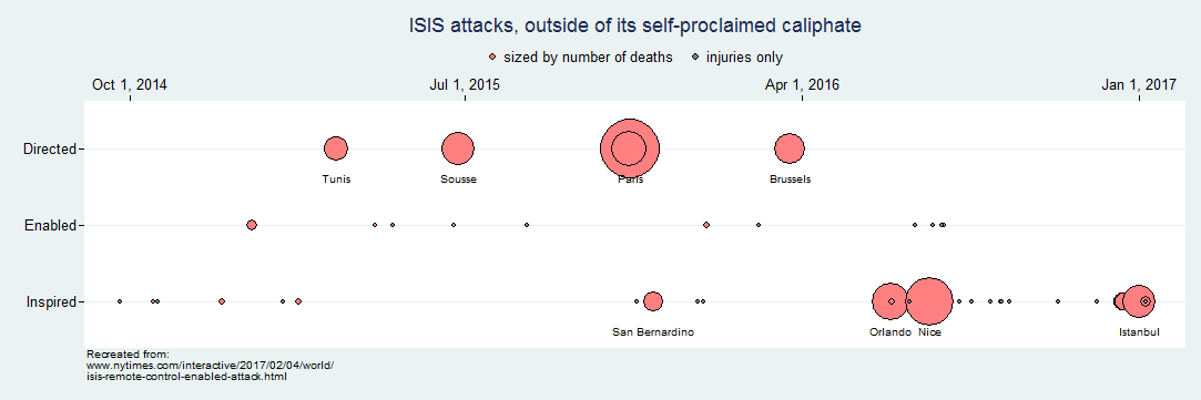
Color, Legend, Title, Notes
Now we are in the home stretch, and we can use more options to clean up color schemes, the legend, and add a title and notes. Notice that the colors are assigned in each graph layer, while the legend and text are addressed as global options.
twoway (scatter ISIS1 ISIS0 attack [w=dead], ///
        mfcolor(red*.5 gray) mlcolor(gs50 gs50) mlwidth(thin thin)) ///
    (scatter isis2 attack, ///
     msymbol(none) mlabel(location2) mlabposition(0) mlabcolor(black)) ///
    , yscale(range(0.5 3.5) reverse noline) ///
    ylabel(1(1)3, valuelabel angle(horizontal)) ///
    xtitle("") xscale(alt noline) tscale(range(1Sep2014 1Feb2017)) ///
    ysize(2) xsize(6) ///
    legend(order(1 2) position(12) region(style(none))) ///
    title("ISIS attacks, outside of its self-proclaimed caliphate") ///
    note("Recreated from:" ///
        "www.nytimes.com/interactive/2017/02/04/world/" ///
        "isis-remote-control-enabled-attack.html")
If you wanted to continue to better match the original, you might:
- relabel the time line.
- come up with a little tighter position for the location labels, which vary in the NYTimes original.
A final quality that we cannot mimic in Stata is the "transparency", the way the overlaid markers add to the intensity of color. In Stata we simply have "the last ink applied, wins".