It is often useful to be able to visualize the distinction between several different models under consideration. This page illustrates a graph that overlays data points and two different regression models. First we will draw each model separately, illustrating two different coding strategies for layering points and lines. Then we will combine these strategies in the final graph.
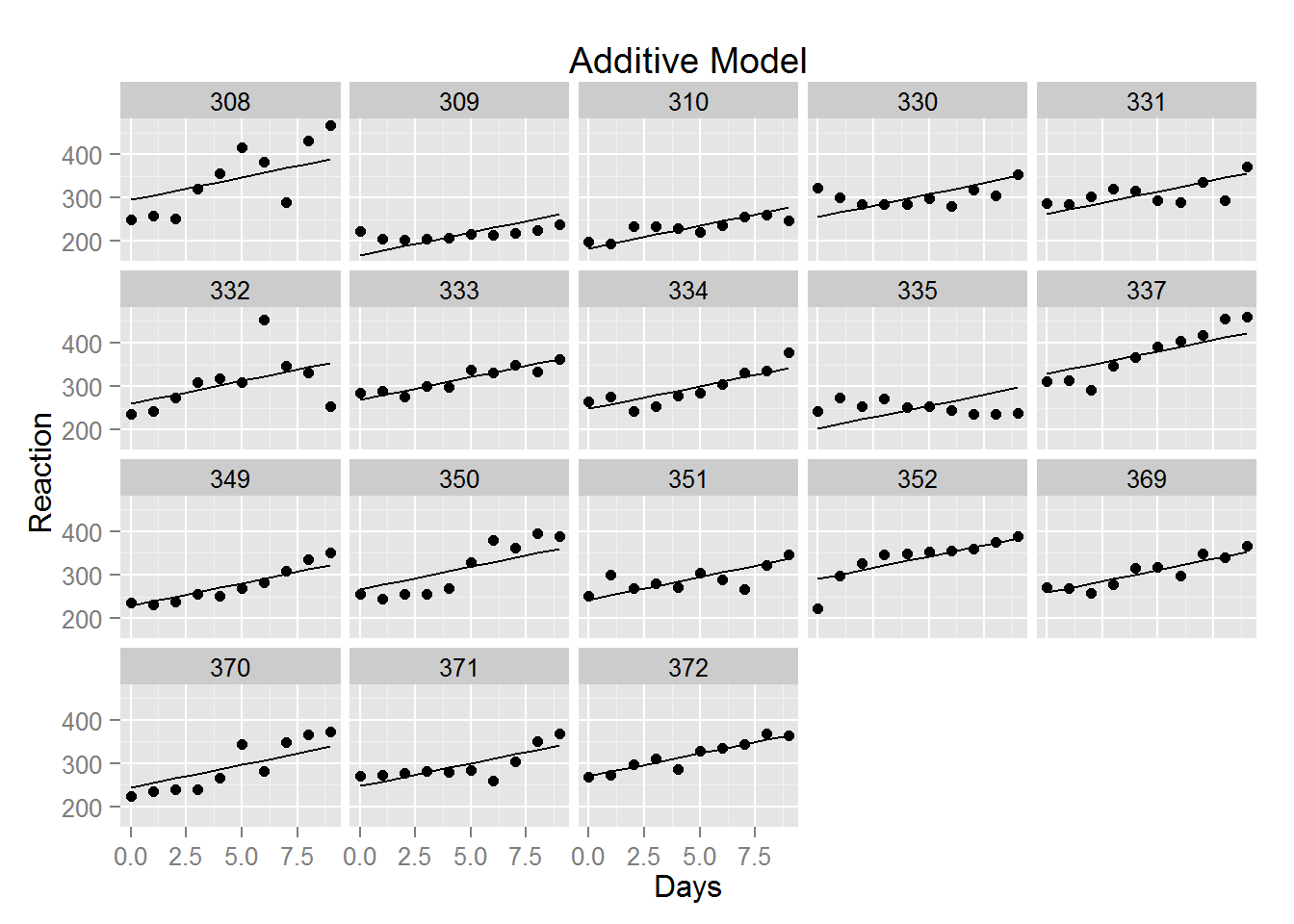
With ggplot2, graphics can be saved as objects. The graph below is specified in layers. In the first layer, qplot() creates a panel of scatterplots, one for each subject in the study. To that is added a second layer with lines connecting predicted values, i.e. the regression lines for each subject.
library(lme4) # to access the example data
library(ggplot2) # for the graphing routines illustrated here

# Fit the additive model
fit <- lm(Reaction ~ Days + Subject, sleepstudy)

plot1 <- qplot(x=Days, y=Reaction, data=sleepstudy,
            facets=~Subject, main="Additive Model") +
            geom_line(aes(x=sleepstudy$Days, y=predict(fit)))
plot1
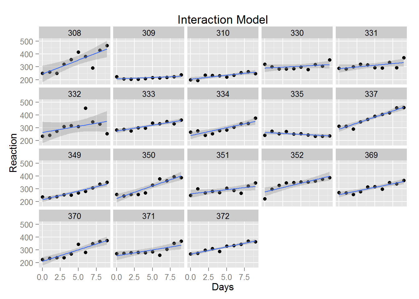
Drawing the model with interaction effects is easier to code, because this is equivalent to estimating and drawing a simple regression line for each subject, separately. Here a single call to qplot() creates both layers by specifying multiple geom parameters.
# The interaction model (note we don't actually run lm() )
# fiti <- lm(Reaction ~ Days * Subject, sleepstudy)

plot2 <- qplot(x=Days, y=Reaction, data=sleepstudy, facets=~Subject,
            geom=c("point","smooth"), method="lm", main="Interaction Model")
plot2
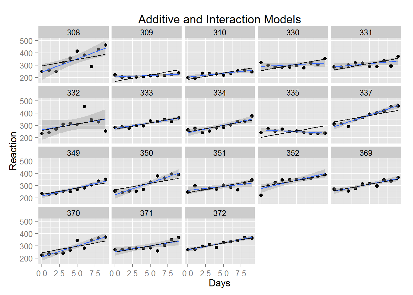
Layering the previous graphs together means picking one graph as the base layer, and adding the additional geometric object as another layer. Here, using the graph of the interaction model as the base layer is convenient, and we only have to add one layer with the line for the additive model (and change the main title).
plot3 <- plot2 +
    geom_line(aes(x=sleepstudy$Days, y=predict(fit))) +
    labs(title="Additive and Interaction Models")
plot3
From here we might explore other options, like suppressing the confidence interval around the interaction regression line, adding a legend, and/or changing the labeled values on the Days axis.
Statistically, we might like to estimate the other model, and compare the models with an F test, in order to decide if, as our eyes suggest, one model fits the data better than the other.
Last Revised: 1/23/2015