Racial Patterns in State Trends in Prison Admissions 1983-2003: Drug and Non-Drug Sentences and Revocations
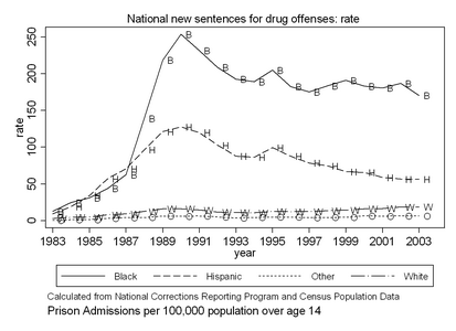
From the National Corrections Reporting Program (NCRP) data, we have produced graphs showing the racial trends in prison admissions 1983-2003 for the 32 states that participated in the NCRP. Prison admissions are distinguished according to whether they are new sentences or revocations and whether the the offender’s governing offense is a drug crime or some other kind of crime. These graphs are useful for understanding the historical trends that contributed to today’s patterns. There is always a lag of several years before NCRP data is available to the general research community for analysis. This information is provided in three Adobe Acrobat PDF files, one relatively small and the other two large.
| If you download this information or find it useful, I’d appreciate hearing from you by email. | |
| Introduction and National Graphs (PDF file is 13 pages, 142 KB). This report shows how the “drug war” was the main source of the increase in Black incarceration, first through drug sentences and then through revocations of drug offenders. The report also explains the terms and methodology relevant to understanding the graphs in the two larger files. |
 |
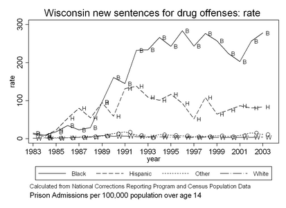
| All state graphs (PDF file is 255 pages, 2.4 MB) for 32 states, one at a time, 15 graphs on 8 pages per state, both comparing races within admission types and comparing admission types within race. Monochrome, easy to read on the screen or print for copying. (See below if you want to download only a few particular states.) |
 |
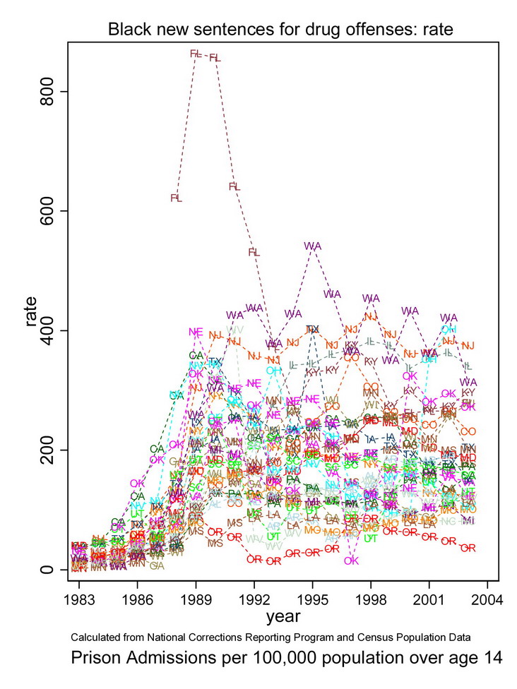
| Comparisons of state rates and disparity ratios across time. (PDF file is 58 pages, 2.3 MB). Each graph shows all states across time for a given race and admission type. For each graph, there is the original and a “close up” that eliminates extreme cases to make it easier to see the patterns for other states. High-resolution color graphics look good on a screen, are easiest to read in color but are legible when printed in monochrome. |
 |
| Individual State Graphs. (Each PDF file is 8 pages, about 80KB.). Participation in the NCRP is voluntary. We have data for 32 states. In some cases, state data are incomplete. If information is missing from a graph (or in some cases, if a graph is missing) this is because the information is unavailable for that state from the NCRP. If a state is not listed, we do not have data for it. You will need this “Introduction” file for explanation about the graphs if you did not download the national graphs. The introductory material is exactly the same in this introduction file as in the national graph file. All of these files are included in the “All state graphs” file (StateGraphs.pdf) above. |
|